Adding responsive export to Design to HTML
How my Figma to code plugin turns several frames of one page into a single responsive HTML file: name-matched merging, mobile-first breakpoints read from the frame widths, and a mixed-text bug that shipped invisible numbers.

4 min read


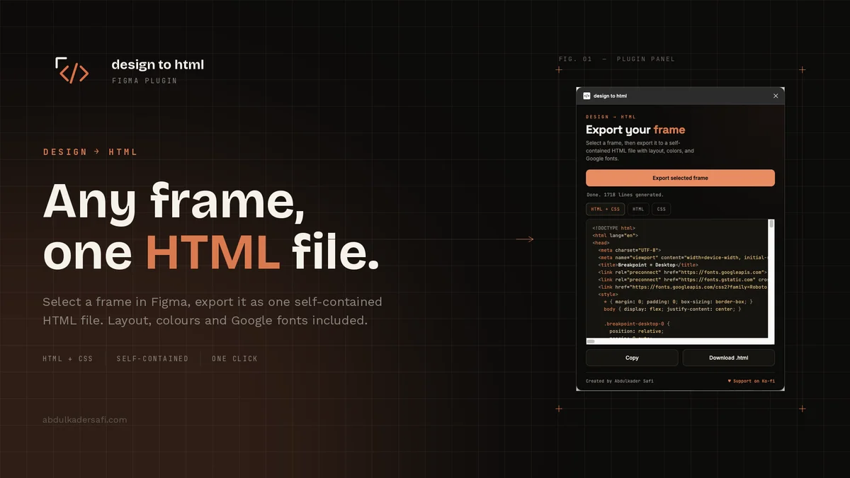
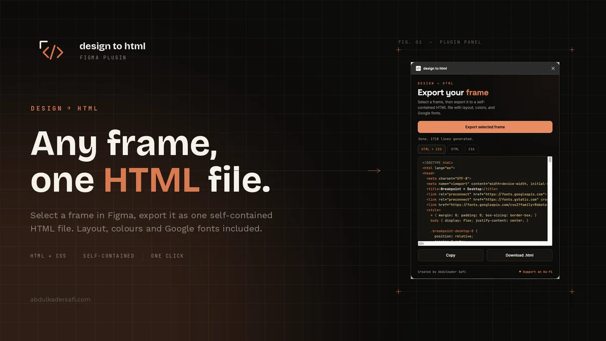
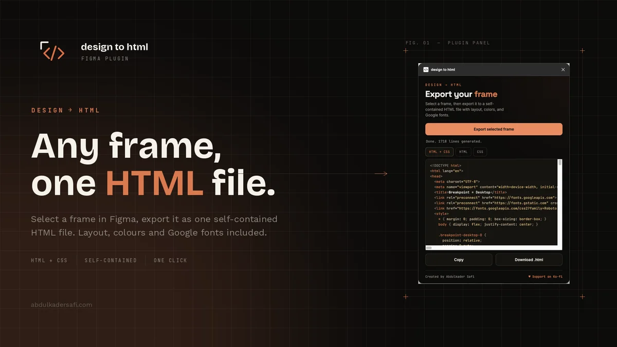
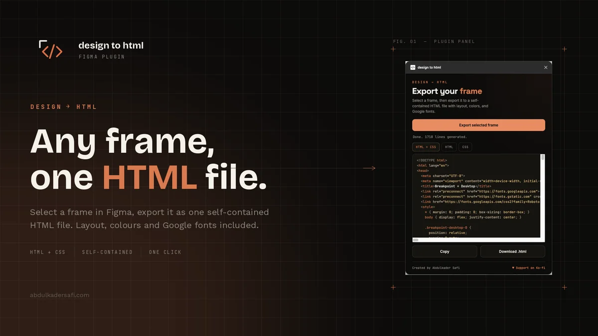
Design to HTML exported one frame at a time. Select a frame, get a page. But most designers draw the same page more than once, a desktop version and a mobile version, sometimes a tablet in between. Exporting each on its own and stitching them together by hand is the boring part. So now you select all of them at once and get one responsive file that reflows.
Name the frames with a shared prefix and a variant after a dash: Home Page - Desktop, Home Page - Tablet, Home Page - Mobile. The part before the last dash groups them. The label after it is just a name. Select two or more, export, and you get a single HTML file with CSS media queries or Tailwind responsive prefixes. Any subset works: desktop and mobile, laptop and tablet, whatever the page actually needs.
How the merge works
The hard part is turning separate frame trees into one page without duplicating the markup. I build the page from the smallest frame's structure, then overlay the larger frames on top of it. Each element is paired across the frames by layer name, and by position when a layer has no name, so the desktop title and the mobile title are understood to be the same thing. That element gets one class and a style per breakpoint.
From there the output is mobile-first, the way you would write it by hand. The base styles come from the smallest frame and apply everywhere. Each larger breakpoint overrides only the properties that actually change. If a heading is 32 pixels on mobile and 58 on desktop, mobile sets it once and the desktop breakpoint changes the font size alone, nothing else.
Two things fall out of this for free. An element that sits in a different container on mobile than on desktop, say a menu that moves into a drawer, is kept in both places and shown or hidden per breakpoint. And text that reads differently at each size, a short label on mobile and a longer one on desktop, is split in two and toggled. I did not write a special case for either. The base-anchored merge produces them on its own.
Breakpoints from the design
The first version snapped each frame to the standard breakpoint at or below its width. A 1440 desktop frame landed on 1280, and with nothing between it and mobile, the mobile layout stretched all the way up to 1279 pixels. On a normal laptop you got the phone layout. That felt wrong, and it was.
Now each larger layout switches on around the midpoint between it and the next-smaller frame, snapped to the nearest standard breakpoint (640, 768, 1024, 1280, 1536). A mobile frame at 390 and a desktop frame at 1440 switch at their midpoint near 915, which snaps to 1024. Desktop shows from 1024 up, mobile below it. The breakpoint sits between the two designed sizes, where a developer would put it, not at the larger frame's own width.
Two bugs worth naming
The first shipped invisible numbers. A stat like a white "300" with a yellow "+" is one text layer with two colored runs. My merge styled the layer with its single style, but a mixed layer has no single color, so the text came out with no color at all and rendered near black on a dark background. The fix was to render each run as its own span with its own color, the same way the single-frame export already did.
The second was speed. The merge exported every icon and image once per frame, so a logo that appears in all three frames was exported three times even though only one copy survives in the output. I now export the asset only for the frame whose copy is kept and skip the rest. On a three-frame page that is about a third of the export work it used to do.
Where it is
Responsive export sits behind the same one-click export as everything else. Select your frames, pick CSS or Tailwind, and download. It is on the Figma Community and the code is on GitHub, free to use.
Last updated 17 Aug 2026 · filed under Tailwindcss, typescript, html, css, plugin, tools, figma, frontend, ui