Sufra
A meal subscription brand for Kuwait, designed from a blank page: name, position, palette, type, copy, then the three surfaces the business would run on. 162 frames and 1,719 prototype links across a 28 page marketing site at two breakpoints, a 32 screen mobile app, and a 46 screen dashboard covering both the subscriber account and the operations CMS. The position is taken from why people cancel rather than from taste, and the whole product is built around one number: the 22:00 kitchen cutoff.
- Role
- Research, brand, copy, UX and UI design
- Timeline
- 2 days
- Year
- 2026
- Status
- Completed
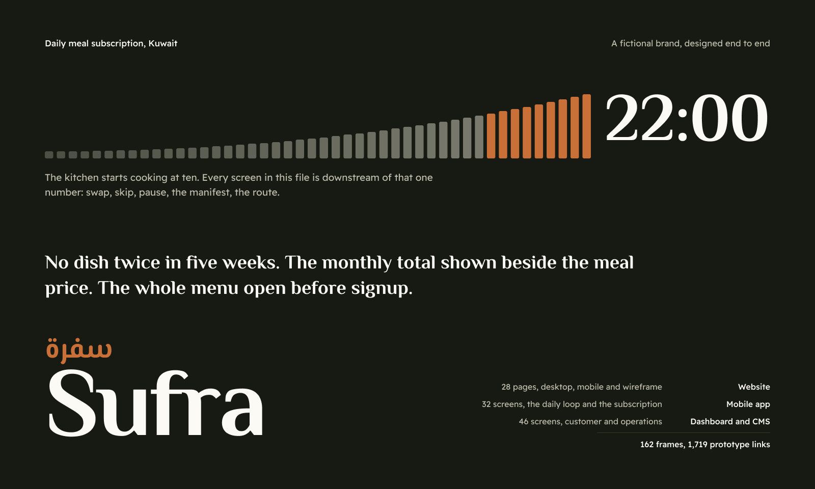
Sufra is a fictional meal subscription brand for Kuwait, taken from a blank page to a designed product. Nothing about it existed at the start: no name, no palette, no copy, no idea what the thing should promise. The point was to prove out the whole chain rather than the part I usually get handed, which is a finished brand and a request for screens.
Open the full Figma file to walk every screen and run the prototypes.
The file holds 162 frames and 1,719 prototype links across three surfaces. A 28 page marketing site drawn at desktop and mobile plus a full wireframe set, 84 frames. A 32 screen mobile app covering signup and the daily loop. A 46 screen dashboard split between the subscriber account and the operations CMS, which runs to all 36 admin screens rather than a representative handful.
Everything sits on one design system: four variable collections, 128 tokens, 27 text styles with separate Latin and Arabic line height ramps, and a component library of 21 sets plus a 39 icon set. No frame carries a hardcoded colour, font or spacing value. When the palette changed direction mid-build, the whole file recoloured from one edit.
The research came first and it decided the design. Acquisition is not the problem in this category; week two is. Only 35 to 50 percent of first time customers place a second order, 60 to 70 percent of subscribers are lost between order one and order three, and monthly churn sits near 10.8 percent. Menu repetition causes about a third of cancellations and price about 29 percent. No brand in Kuwait addresses either one in its marketing.
So the position is three checkable promises rather than an adjective. No dish twice inside five weeks, with the app showing when you last ate it. The monthly total printed at the same weight as the per meal price. The whole menu open before signup, with no email gate.
Four problems shaped the work, and the visual ones were the easiest.
The category's message space is already occupied. Calo has 280,000 customers and 18 million meals delivered on "healthy meals for busy people", and every competitor in the Gulf is a variation on healthy, calorie counted and convenient. Green is the category uniform, along with the leaf, the macro ring and the white bowl on marble. Any design that reaches for those reads as a copy of the market leader. That ruled out the obvious palette before a single frame was drawn.
The brief asked to serve four audiences at once: gym, busy professionals, families and health specific diets. A hero that addresses four audiences addresses none, and even Calo picked one. I pushed back on this and designed one primary message with a plan selector underneath, then wrote the alternative into the documentation so it could be overruled with the cost understood.
Kuwait does not work the way the category guides assume. This is a nightly cutoff and daily fresh delivery market, not the weekly box model, which changes the product completely: a "tomorrow" screen rather than a week planner. Payment is KNET, around 80 percent of online payments, with recurring billing through KFAST. The dinar carries three decimals, so money is stored in integer fils and every price on every screen has to show them. Addressing is governorate, area, block, street, building, with no useful postcode, so area is a foreign key and not a text field. Get that wrong and the routing model underneath falls apart.
Bilingual was the hardest constraint on type. Arabic runs taller than Latin and needs more leading, and reusing Latin line heights on Arabic text is the clearest sign of a site that was translated rather than designed. Since a properly designed Arabic version is the actual differentiator in this market, it could not be left to whoever drew the frame.
The cutoff turned out to be the spine. Every night at 22:00 the kitchen starts cooking and tomorrow locks, which means swap, skip, pause, the production manifest and the delivery route all read from one number. Rather than treat it as a detail, it became a designed component: a track of ticks that rise toward the deadline and empty as time runs out, 14 ticks with three hours left, three with an hour, one with ten minutes. Never a DAYS HRS MIN SEC box row, because there is a real deadline here every night and a stock urgency widget on top of a real one insults the visitor.
Where that component belongs took a correction. I first put it in the marketing site nav, and it was wrong: a countdown carries no meaning for someone with no order running out tonight, so the ticks were decoration pretending to be information. It came off the site, which now explains the rule in words that stand alone, and stayed in the app and the operations dashboard, where the user genuinely has something pending. The same reasoning put it back in the admin topbar.
The second invented component answers the churn data directly. A repeat chip on every dish shows when you last ate it: "Not since 22 June", or "You had this 9 days ago" in the cutoff colour. It is a small rule and small type rather than a tinted pill, because a pill around every scrap of metadata reads as a component kit. Nobody in this category shows this, and it is the visible half of the five week promise. Its operational half is an admin screen that lists every customer scheduled a dish they had inside the window, before the cutoff, while it can still be fixed.
The palette settled on olive after four alternatives were built as live theme modes and compared side by side. Ink is a green black rather than the cool blue charcoal that every dark interface defaults to, surfaces are a warm off white with a green grey cast, the accent is a burnt orange, and green appears only on nutrition data. Type is El Messiri for display and Readex Pro for text and Arabic, both covering Latin and Arabic in one design so an Arabic headline is the same voice as its English twin, and deliberately not Cairo or Tajawal, which sit on every Gulf site.
The three surfaces are designed to different rules on purpose. The marketing site sells and has to pass a technical SEO review: real headings, real content, no text baked into images, an indexable menu, and the full dish catalogue open. The operations CMS runs on density, because dispatch staff use it all day at speed, so it is 13.5px body and 44px rows with the sidebar on the olive ink. The subscriber dashboard is a once a month laptop visit, so it runs looser. All three read as the same brand because they share one token set, and the dark olive chrome carries it across.
The admin covers all 36 screens, including the ones that only matter operationally: tonight's manifest as the printable production list, the route board with capacity warnings, cohort retention by signup month, and an audit log that marks every action reversible or not.
About this project
-
No. It is a fictional brand, designed as a self-initiated case study, and every price and customer number in the file is invented. The market research behind it is real and sourced: the retention figures, the churn causes, the competitor pricing and the Kuwait payment and addressing details all come from published data. Keeping those two things separate mattered, because plausible numbers in a case study can be mistaken for market claims.
-
That is exactly why. Green is the category uniform in the Gulf, along with the leaf, the macro ring and the white bowl on marble, and a brand that wears the uniform reads as a copy of the market leader. The palette landed on olive: a green black ink rather than the cool blue charcoal most dark interfaces default to, a warm off white with a green grey cast, and a burnt orange accent. Green appears only on nutrition data, where it means something. The cost is losing an instant read of healthy, and the gain is being recognisable at all.
-
Because price is the second biggest reason people cancel in this category, at about 29 percent, and every competitor hides the monthly figure behind a per meal number that looks small. Showing it will cost signups on paper. It should also cost fewer month two cancellations, which is the cohort this kind of business cannot afford to lose. It is a decision worth measuring rather than assuming, and it is documented that way.
-
Because the operations screens are where a meal subscription is actually run, and they are the part most portfolios skip. Tonight's manifest, the route board, capacity by zone and window, the repeat exposure alert and the cancellation reasons report are the screens that decide whether the brand's promises survive contact with a kitchen. Designing eight of them would have shown a visual language. Designing all of them forced decisions about density, printing, roles and destructive actions that a sample would have let me avoid.
-
As a version, not a translation field. The token system carries two line height ramps, Latin and Arabic, with the Arabic values larger at every size, because Arabic runs taller and reusing Latin leading on it is the clearest sign of a site that was translated after the fact. Both typefaces cover Latin and Arabic in one design, so an Arabic headline is the same voice as its English twin rather than a different font at the same size. The full right to left pass across every screen is the outstanding piece of work.
-
Three things, and it is more useful to name them than to imply the file is done. The right to left Arabic pass exists in the type system and on individual screens but is not drawn across the full set. Photography is placeholder, so the dish imagery is a grey frame rather than the hard raking light the art direction calls for. And there is no wordmark yet: the nav sets the brand name in the display face, which is placeholder type rather than a designed bilingual mark.