Design Systems Explained: Atoms, Molecules, Organisms, Templates, and Pages
If you’ve ever felt like UI design is a chaotic puzzle, design systems can bring order to that chaos. They help you build consistent, scalable interfaces. And the secret sauce? A structure that breaks things down into simple, reusable building blocks, just like in chemistry.
If you’ve ever felt like UI design is a chaotic puzzle, design systems can bring order to that chaos. They help you build consistent, scalable interfaces. And the secret sauce? A structure that breaks things down into simple, reusable building blocks, just like in chemistry.
Let’s walk through the five levels of a design system, using a familiar analogy: atomic design.
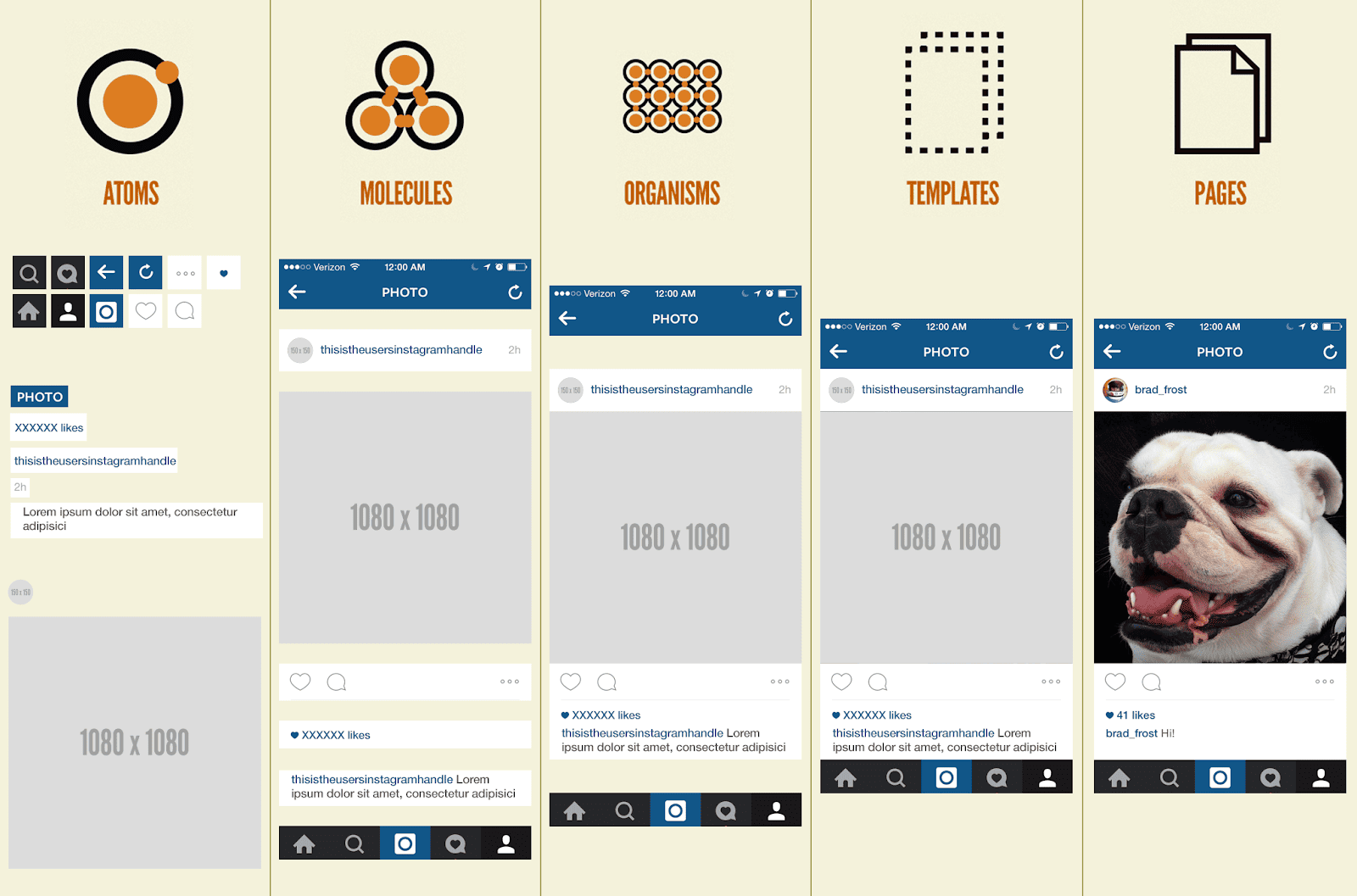
1. Atoms
The smallest building blocks.
Think: buttons, icons, input fields, labels.
Each one on its own doesn’t do much. Just like hydrogen or oxygen atoms, they only become useful when combined with others.
Examples from the image:
- Search icon
- Home icon
- Like button
- A block of text (“XXXXXX likes”)
These are your raw UI ingredients.
2. Molecules
Now we combine atoms to make basic components.
Think: search bars, like counters, image cards.
A molecule takes a few atoms and gives them context.
Examples from the image:
- A user handle + time posted + like counter
- Image + caption + like button
It’s still pretty small in scope, but it’s now functional.
3. Organisms
Here’s where it gets more powerful.
Organisms are groups of molecules that form distinct sections.
Think: a complete photo post, a navigation bar, or a user profile preview.
Examples from the image:
- A full Instagram post (image, caption, user info, likes, buttons)
- The bottom nav bar
This level gives real structure to the interface. It’s where things start feeling like a full product.
4. Templates
Now we’re organizing organisms into layouts.
Templates define the structure without content. They show where things go.
Think of a wireframe with placeholder text and images.
Example from the image:
- An Instagram feed layout without real user data
This helps you test how different organisms look together before adding real content.
5. Pages
Finally, you fill in real content.
Pages are templates with actual data.
This is what users see.
Example from the image:
- A complete Instagram post with a real image and user (“brad_frost” and his dog)
This stage lets designers review how real content behaves, does it overflow? Wrap? Look awkward?
Why This Matters
Design systems built this way make your UI:
- Consistent: Same components everywhere.
- Reusable: Build once, use in 10 places.
- Scalable: Add features without breaking layout.
- Efficient: Faster design and dev process.
Real-Life Analogy
Imagine building a car:
- Atoms: bolts, screws, wires
- Molecules: engine parts, wheel assemblies
- Organisms: the engine, the wheels
- Templates: the frame of the car
- Pages: the finished car with paint and seats
You wouldn’t start with a full car. You build it block by block.
Final Thoughts
Whether you’re working solo or part of a big team, atomic design gives you a clear map. It helps avoid the “messy spaghetti UI” trap and keeps your product clean, usable, and easy to scale.
Start small. Think atomic. Then grow your system from there.
🚀 Let’s build something amazing! If you have a project in mind or need help with your next design system, feel free to reach out.
📧 Email: safi.abdulkader@gmail.com | 💻 LinkedIn: @abdulkader-safi | 📱 Instagram: @abdulkader.safi | 🏢 DSRPT
Drop me a line, I’m always happy to collaborate! 🚀

Building scalable systems and developer-first tools. Lead Software Engineer at DSRPT.
Frequently asked
-
Atomic design is a methodology that breaks a user interface down into five levels of reusable building blocks, using a chemistry analogy. The levels are atoms, molecules, organisms, templates, and pages, moving from the smallest pieces up to fully assembled screens. Structuring a design system this way brings order to chaotic UI work and makes interfaces consistent and scalable.
-
The five levels are atoms, molecules, organisms, templates, and pages. Atoms are the smallest pieces like buttons, icons, and input fields, molecules combine a few atoms into functional components such as a search bar or like counter, and organisms group molecules into distinct sections like a full post or navigation bar. Templates arrange organisms into a content-free layout that shows where things go, and pages fill those templates with real content to create what users actually see.
-
A template defines the structure of a screen without real content, much like a wireframe with placeholder text and images, so you can test how organisms fit together. A page is that same template filled with actual data, such as a real image and user. The page stage lets designers review how real content behaves and whether it overflows, wraps, or looks awkward.
-
An atomic design system makes your UI consistent because the same components are used everywhere, and reusable because you build a component once and use it in many places. It is also scalable, letting you add features without breaking the layout, and efficient since it speeds up both the design and development process. Overall it helps you avoid messy, tangled UI and keeps the product clean and easy to grow.
-
A helpful real-life analogy is building a car. Atoms are the bolts, screws, and wires, molecules are engine parts and wheel assemblies, organisms are the assembled engine and wheels, the template is the frame of the car, and the page is the finished car with paint and seats. You would never start with a full car, you build it block by block, and the same is true for UI built with atomic design.