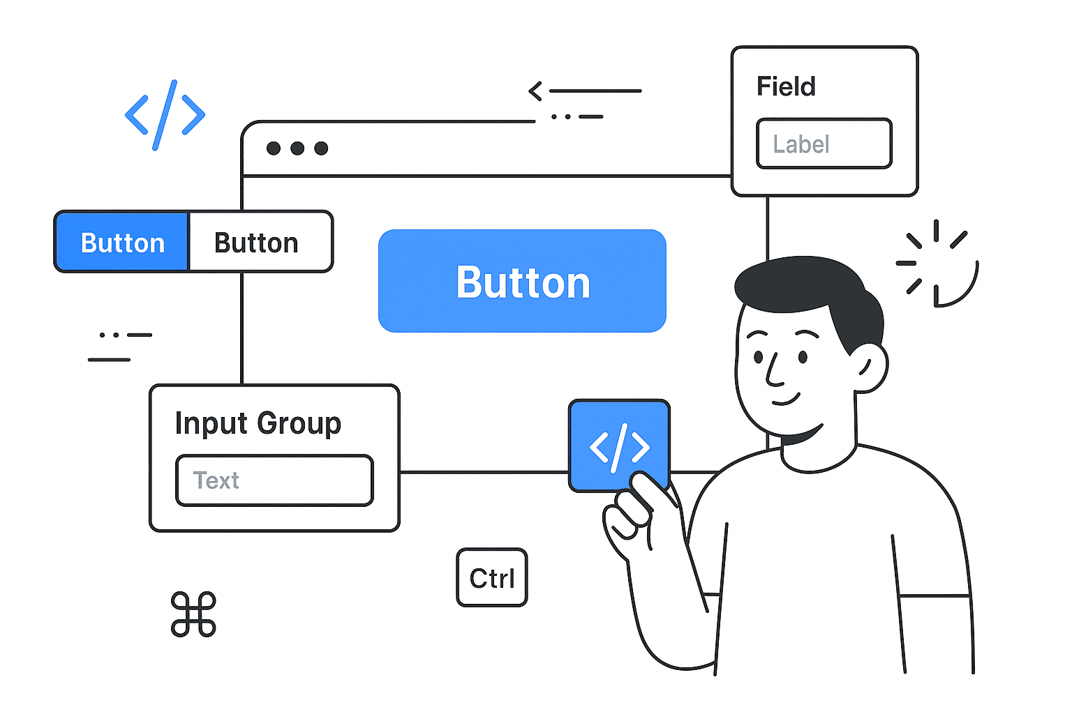
TL;DR: The latest release adds Spinner, Kbd, ButtonGroup, InputGroup, Field, Item, and Empty components — all built to be composable and framework-agnostic.
In the October 2025 update, the shadcn/ui library introduces a set of new primitives designed to speed up everyday UI patterns — the “boring stuff we rebuild over and over” as the changelog puts it. These additions emphasize flexibility, interoperability, and developer ergonomics.
Below I’ll walk you through each component, show sample usage, and highlight how they integrate with forms, layout, and variants. By the end, you’ll see how to leverage them in your next React / Next.js / App Router project (or any React UI stack).
Overview of the New Components
Here’s a quick list of the new components:
- Spinner — loading indicator
- Kbd / KbdGroup — keyboard key labels
- ButtonGroup — grouping related buttons (and split-button patterns)
- InputGroup (with Addon, Button, Text) — for combining inputs + icons / buttons / texts
- Field (and its sub-components: FieldLabel, FieldDescription, FieldError, FieldGroup, FieldSet, FieldSeparator) — unified abstraction for form UI
- Item (with ItemContent, ItemMedia, ItemTitle, ItemDescription, ItemActions, ItemGroup, ItemSeparator) — flexible container for list / card style UI
- Empty — a component for empty or placeholder states
These are not mere UI widgets; they’re building blocks meant to slot into various UI architectures (Radix, Base UI, React Aria, others). The changelog explicitly states: “These components work with every component library … Copy and paste to your projects.”
Let’s go component by component.
Spinner
The Spinner is straightforward: an animated icon (typically an SVG) to indicate loading state.
import { Spinner } from "@/components/ui/spinner";

export function SpinnerBasic() {
  return (
    <div className="flex flex-col items-center justify-center gap-8">
      <Spinner />
    </div>
  );
}
You can also include it inside buttons:
import { Button } from "@/components/ui/button";
import { Spinner } from "@/components/ui/spinner";

export function SpinnerButton() {
  return (
    <div className="flex flex-col items-center gap-4">
      <Button disabled size="sm">
        <Spinner />
        Loading...
      </Button>
      <Button variant="outline" disabled size="sm">
        <Spinner />
        Please wait
      </Button>
    </div>
  );
}
If you want to customize it (e.g. with a custom icon), you can replace it:
import { LoaderIcon } from "lucide-react";
import { cn } from "@/lib/utils";

function Spinner({ className, ...props }: React.ComponentProps<"svg">) {
  return (
    <LoaderIcon
      role="status"
      aria-label="Loading"
      className={cn("size-4 animate-spin", className)}
      {...props}
    />
  );
}
The Spinner component thus gives a consistent base you can override or style.
Kbd & KbdGroup
Kbd is designed to render keyboard keys (for shortcuts, hints, etc.). KbdGroup allows grouping sequences of keys.
import { Kbd, KbdGroup } from "@/components/ui/kbd";

export function KbdDemo() {
  return (
    <div className="flex flex-col items-center gap-4">
      <KbdGroup>
        <Kbd>⌘</Kbd>
        <Kbd>⇧</Kbd>
        <Kbd>⌥</Kbd>
        <Kbd>⌃</Kbd>
      </KbdGroup>
      <KbdGroup>
        <Kbd>Ctrl</Kbd>
        <span>+</span>
        <Kbd>B</Kbd>
      </KbdGroup>
    </div>
  );
}
You can embed Kbd elements inside buttons, tooltips, or anywhere to create consistent keyboard hint UI.
ButtonGroup
ButtonGroup helps group buttons in visually consistent layouts, supporting nested groups, separators, split-button patterns, etc.
Simple usage:
import { Button } from "@/components/ui/button";
import { ButtonGroup } from "@/components/ui/button-group";

<ButtonGroup>
  <Button>Button 1</Button>
  <Button>Button 2</Button>
</ButtonGroup>

Nested groups:

<ButtonGroup>
  <ButtonGroup>
    <Button>Button 1</Button>
    <Button>Button 2</Button>
  </ButtonGroup>
  <ButtonGroup>
    <Button>Button 3</Button>
    <Button>Button 4</Button>
  </ButtonGroup>
</ButtonGroup>
Split-button (with ButtonGroupSeparator) and dropdown patterns:
import {
  DropdownMenu,
  DropdownMenuTrigger,
  DropdownMenuContent,
  DropdownMenuItem,
  DropdownMenuSeparator,
  DropdownMenuGroup,
} from "@/components/ui/dropdown-menu";
import { MoreHorizontalIcon, Trash2Icon } from "lucide-react";
import { Button } from "@/components/ui/button";
import { ButtonGroup } from "@/components/ui/button-group";

export function ButtonGroupDropdown() {
  return (
    <ButtonGroup>
      <Button variant="outline">Follow</Button>
      <DropdownMenu>
        <DropdownMenuTrigger asChild>
          <Button variant="outline" className="!pl-2">
            <MoreHorizontalIcon />
          </Button>
        </DropdownMenuTrigger>
        <DropdownMenuContent align="end" className="[--radius:1rem]">
          <DropdownMenuGroup>
            <DropdownMenuItem>Mute Conversation</DropdownMenuItem>
            <DropdownMenuItem>Mark as Read</DropdownMenuItem>
            <DropdownMenuItem>Report Conversation</DropdownMenuItem>
          </DropdownMenuGroup>
          <DropdownMenuSeparator />
          <DropdownMenuGroup>
            <DropdownMenuItem variant="destructive">
              Delete Conversation
            </DropdownMenuItem>
          </DropdownMenuGroup>
        </DropdownMenuContent>
      </DropdownMenu>
    </ButtonGroup>
  );
}
You can also embed ButtonGroup around text inputs:
<ButtonGroup>
  <ButtonGroup>
    <Select ... />  {/* for example */}
    <Input placeholder="10.00" pattern="[0-9]*" />
  </ButtonGroup>
  <ButtonGroup>
    <Button aria-label="Send" size="icon" variant="outline">
      <ArrowRightIcon />
    </Button>
  </ButtonGroup>
</ButtonGroup>
ButtonGroup thus acts as a visual and structural container, letting you compose more complex UI.
InputGroup
InputGroup allows bundling an input with icons, buttons, or text addons.
Basic usage:
import {
  InputGroup,
  InputGroupAddon,
  InputGroupInput,
} from "@/components/ui/input-group";

<InputGroup>
  <InputGroupInput placeholder="Search…" />
  <InputGroupAddon>
    <SearchIcon />
  </InputGroupAddon>
</InputGroup>;
With icons:
import { MailIcon, CreditCardIcon } from "lucide-react";

<InputGroup>
  <InputGroupInput type="email" placeholder="Enter your email" />
  <InputGroupAddon>
    <MailIcon />
  </InputGroupAddon>
</InputGroup>

<InputGroup>
  <InputGroupInput placeholder="Card number" />
  <InputGroupAddon>
    <CreditCardIcon />
  </InputGroupAddon>
  <InputGroupAddon align="inline-end">
    <CheckIcon />
  </InputGroupAddon>
</InputGroup>
Add buttons:
import {
  Popover,
  PopoverTrigger,
  PopoverContent,
} from "@/components/ui/popover";

function InputGroupButtonExample() {
  const { copyToClipboard, isCopied } = useCopyToClipboard();
  const [isFavorite, setIsFavorite] = React.useState(false);

  return (
    <InputGroup>
      <InputGroupInput placeholder="https://x.com/shadcn" readOnly />
      <InputGroupAddon align="inline-end">
        <InputGroupButton
          onClick={() => copyToClipboard("https://x.com/shadcn")}
        >
          {isCopied ? <IconCheck /> : <IconCopy />}
        </InputGroupButton>
      </InputGroupAddon>
    </InputGroup>
  );
}
You can also embed text addons (InputGroupText) and even textarea groups.
One clever pattern: combining spinner + input:
import { Spinner } from "@/components/ui/spinner";

<InputGroup data-disabled>
  <InputGroupInput placeholder="Searching…" disabled />
  <InputGroupAddon align="inline-end">
    <Spinner />
  </InputGroupAddon>
</InputGroup>;
Because the new components are composable, you can mix and match in interesting ways.
Field
This is arguably the most powerful addition. Field wraps form controls, giving you a unified API for labels, descriptions, errors, layouts, grouping, and responsive orientation. It’s built to work with any form library: Server Actions, React Hook Form, TanStack Form, or your own setup.
Basic field:
import {
  Field,
  FieldDescription,
  FieldError,
  FieldLabel,
} from "@/components/ui/field";
import { Input } from "@/components/ui/input";

<Field>
  <FieldLabel htmlFor="username">Username</FieldLabel>
  <Input id="username" placeholder="Max Leiter" />
  <FieldDescription>
    Choose a unique username for your account.
  </FieldDescription>
  <FieldError />
</Field>;
Grouping multiple fields:
import {
  Field,
  FieldGroup,
  FieldSet,
  FieldSeparator,
  FieldLegend,
} from "@/components/ui/field";
import { Input } from "@/components/ui/input";
import {
  Select,
  SelectTrigger,
  SelectContent,
  SelectItem,
} from "@/components/ui/select";
import { Textarea } from "@/components/ui/textarea";
import { Checkbox } from "@/components/ui/checkbox";
import { Button } from "@/components/ui/button";

function FieldDemo() {
  return (
    <form>
      <FieldGroup>
        <FieldSet>
          <FieldLegend>Payment Method</FieldLegend>
          <FieldDescription>
            All transactions are secure and encrypted
          </FieldDescription>
          <FieldGroup>
            <Field>
              <FieldLabel htmlFor="card-name">Name on Card</FieldLabel>
              <Input id="card-name" placeholder="Your Name" required />
            </Field>
            <Field>
              <FieldLabel htmlFor="card-number">Card Number</FieldLabel>
              <Input
                id="card-number"
                placeholder="1234 5678 9012 3456"
                required
              />
              <FieldDescription>
                Enter your 16-digit card number
              </FieldDescription>
            </Field>
            <div className="grid grid-cols-3 gap-4">
              <Field>
                <FieldLabel htmlFor="exp-month">Month</FieldLabel>
                <Select defaultValue="">
                  <SelectTrigger id="exp-month" />
                  <SelectContent>
                    <SelectItem value="01">01</SelectItem>
                    {/* ... */}
                  </SelectContent>
                </Select>
              </Field>
              {/* Year, CVV fields */}
            </div>
          </FieldGroup>
        </FieldSet>
        <FieldSeparator />
        <FieldSet>
          <FieldLegend>Billing Address</FieldLegend>
          <FieldGroup>
            <Field orientation="horizontal">
              <Checkbox id="same-as-shipping" defaultChecked />
              <FieldLabel htmlFor="same-as-shipping">
                Same as shipping
              </FieldLabel>
            </Field>
          </FieldGroup>
        </FieldSet>
        <FieldSeparator />
        <FieldSet>
          <FieldGroup>
            <Field>
              <FieldLabel htmlFor="comments">Comments</FieldLabel>
              <Textarea id="comments" placeholder="Enter comments" />
            </Field>
          </FieldGroup>
        </FieldSet>
        <Field orientation="horizontal">
          <Button type="submit">Submit</Button>
          <Button variant="outline" type="button">
            Cancel
          </Button>
        </Field>
      </FieldGroup>
    </form>
  );
}
Key features:
- orientation prop: supports "horizontal", "vertical", or "responsive" so UI adapts to container width.
- Works with any control (input, textarea, select, checkbox, radio, switch, etc.).
- FieldGroup and FieldSet let you compose multi-section forms with separators or legends.
- Layout is consistent, so spacing, alignment, and error placement become trivial.
If you’re building complex forms, Field drastically reduces your boilerplate and guardrails.
Item
Item is a flexible, styled container to represent list items, cards, navigation entries, etc. It’s a component you “build so many times” and now it’s packaged.
Basic:
import {
  Item,
  ItemContent,
  ItemMedia,
  ItemTitle,
  ItemDescription,
} from "@/components/ui/item";
import { HomeIcon } from "lucide-react";

<Item>
  <ItemMedia variant="icon">
    <HomeIcon />
  </ItemMedia>
  <ItemContent>
    <ItemTitle>Dashboard</ItemTitle>
    <ItemDescription>Overview of your account</ItemDescription>
  </ItemContent>
</Item>;
With actions, media, and layout:
import { Button } from "@/components/ui/button";
import { BadgeCheckIcon, ChevronRightIcon } from "lucide-react";
import {
  Item,
  ItemContent,
  ItemMedia,
  ItemTitle,
  ItemDescription,
  ItemActions,
} from "@/components/ui/item";

<Item variant="outline">
  <ItemContent>
    <ItemTitle>Basic Item</ItemTitle>
    <ItemDescription>A simple item description.</ItemDescription>
  </ItemContent>
  <ItemActions>
    <Button variant="outline" size="sm">Action</Button>
  </ItemActions>
</Item>

<Item variant="outline" size="sm" asChild>
  <a href="#">
    <ItemMedia>
      <BadgeCheckIcon className="size-5" />
    </ItemMedia>
    <ItemContent>
      <ItemTitle>Your profile has been verified.</ItemTitle>
    </ItemContent>
    <ItemActions>
      <ChevronRightIcon className="size-4" />
    </ItemActions>
  </a>
</Item>
With groups:
import { ItemGroup, ItemSeparator } from "@/components/ui/item";

<ItemGroup>
  <Item> … </Item>
  <ItemSeparator />
  <Item> … </Item>
</ItemGroup>;
You can embed avatars, badges, multi-line descriptions, and interactive actions easily. It’s a strong abstraction for list-heavy UIs (dashboards, settings lists, notification feeds, sidebars, etc.).
Empty
Empty is meant to elegantly handle “no data / empty state” UI. Instead of handcrafting a placeholder view everywhere, you can standardize on Empty.
Usage is simple (the changelog doesn’t give a ton of detail, but it’s intended as a placeholder component).
import { Empty } from "@/components/ui/empty";

export function NoResults() {
  return (
    <Empty>
      <Empty.Title>No items found</Empty.Title>
      <Empty.Description>
        Try adjusting your filters or search terms.
      </Empty.Description>
      <Empty.Action>
        <Button>Reset filters</Button>
      </Empty.Action>
    </Empty>
  );
}
You can customize messaging, icons, and actions. Use it to ensure consistent look & feel across your app when there’s no data to show.
Why These Additions Matter (for Developers & AI/LLM Users)
1. Reduced Boilerplate + Consistent Patterns
A lot of UI work is repetitive: labels, spacing, button layouts, input-addon combos. These new components internalize those patterns. If you’re teaching or auto-generating UI via an LLM (or code scaffolding), having a restricted set of primitives makes generation more predictable.
Imagine prompting an LLM: “Create a search input with icon + button + loading spinner.” With InputGroup + Spinner + Button, that mapping is now direct and standardized. No guessing whether to use wrappers, manual flex containers, or custom CSS.
2. Composable & Framework-agnostic
The changelog emphasizes these components “work with every component library, Radix, Base UI, React Aria, you name it.” That means you can layer them alongside lower-level primitives or more advanced UI systems. You’re not locked in.
From an AI tooling angle, this makes it safer to generate UI that mixes libraries without conflicts.
3. Type Safety & Extensibility
Because these components wrap and parameterize children, props, spacing, and orientation, you can extend them (via composition or subclassing) without breaking consistency. Future UI generations (automated or curated) can rely on these semantics.
4. Better Accessibility & UX Defaults
These components include accessible defaults (e.g., proper labeling, role attributes) inherited from the underlying primitives. As a developer, you don’t have to re-implement accessible wiring each time.
5. SEO / AI-optimizable Documentation
From an SEO or AI indexing standpoint, having a single canonical primitive (e.g. Field) to describe form semantics helps tools (like crawling bots, or AI indexing) understand your UI. Instead of scattered div + label + input combos, everything funnels through the Field API.
Tips & Best Practices
Here are some tips when adopting these new components:
- Gradually migrate: You can start using Spinner or Kbd in existing views without refactoring everything.
- Combine thoughtfully: E.g. ButtonGroup wrapping InputGroup + Button is a pattern to watch.
- Prefer Field for new forms: Especially as complexity grows (multiple sections, conditional logic, error messages), Field saves you structure headaches.
- Use Item in list-heavy UIs: Notifications, settings pages, dashboards — Item gives you a base card/list block you can adapt.
- Always include Empty states: Don’t leave screens blank; standardizing your empty UI improves UX and consistency.
- Override via sub-classing or theme: If your design system demands slight variations, wrap or extend these primitives instead of copying them.
- Document your own “pattern library”: As you adopt these in your codebase, capture how you use Field + InputGroup etc. This helps onboard teammates or future AI assistants.
Summary & What to Try Next
The October 2025 update to shadcn/ui is more than just new widgets — it’s a leap toward a practical, composable UI primitive set. For developers building dashboards, admin panels, SaaS apps, or content-heavy pages, these building blocks reduce friction, enforce consistency, and play nicely with other UI systems.
To get started:
- Install or upgrade to the latest version of shadcn/ui.
- Try replacing one form or list view with Field + InputGroup + ButtonGroup + Item.
- Use Empty in places you’d otherwise put “No results” messages.
- Encourage your AI agents / code generators (if any) to target these primitives.
🤝 Need a Custom RSVP System or Dashboard?
I help businesses build tools that actually work , even on tight deadlines.
Whether you're planning an event, need internal tools, or want a custom dashboard for your team , I can help.
Reach out
📧 Email: safi.abdulkader@gmail.com | 💻 LinkedIn: @abdulkader-safi | 📱 Instagram: @abdulkader.safi | 🏢 DSRPT
Drop me a line, I’m always happy to collaborate! 🚀


