
Safi Site Audit 0.6.0: the note that was also a database
A 100-page audit wrote a 5.9MB Markdown note, because the whole report was inlined as JSON inside it. Splitting that into three files per site fixed the lag, and rebuilding the dashboard on top of it turned up a CSS specificity bug that had been quietly overriding every button rule I wrote.

8 min read


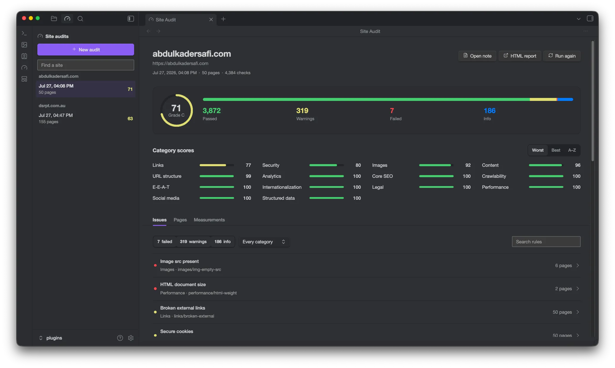
Safi Site Audit is the Obsidian plugin wrapper around Safi Studio Scanner. You give it a URL, it crawls the site inside your vault, and it saves the report as a note. This morning I shipped 1.0.2 of the engine underneath it. This is the afternoon, spent on the plugin that consumes it.
The trigger was not the new engine, though. It was that opening a saved audit had become slow enough to be annoying.
The note that was also a database
Every audit used to be one Markdown file. Frontmatter for the list, the rendered Markdown report for reading, and then the entire report object serialised as JSON in a fenced block at the bottom, so the dashboard could redraw the rich view without crawling the site again.
That design is fine at twenty pages. Here is what it looks like at a hundred:
report.md      852 KB
report.json    5.0 MB
The note was both of those in one file. Nearly six megabytes of Markdown, of which 86 percent was a single line of JSON that no human would ever read. Obsidian has to parse that file as a note: index it, cache its metadata, syntax-highlight it, hand it to the editor. It did all of that faithfully every time the file was opened, and it took its time about it.
The fix was to stop asking a note to be a database. Each run now writes three siblings into a folder named after the site:
Site Audits/
  example.com/
    2026-07-27-16-08.md      readable report, opens in Obsidian
    2026-07-27-16-08.json    full report data, what the dashboard reads
    2026-07-27-16-08.html    standalone report, opens in a browser
The note is frontmatter and Markdown now, nothing else. The JSON sits beside it in a file Obsidian never parses as a note, and the dashboard reads it only when you actually open that audit. The HTML export was already being generated by the engine and was previously thrown away, so exposing it cost nothing.
The sidebar list still reads only frontmatter through the metadata cache, so listing every audit you have ever run touches zero megabytes of JSON.
Audits saved by 0.5.x still open. The old parser is fifteen lines and there was no reason to delete it.
Reading the new engine
The 1.0.2 release added two things the plugin could use immediately.
Progress was the obvious one. audit() returns a promise and says nothing until it resolves, so a hundred-page crawl was a spinner and a hope. Swapping it for auditStream() and folding the events into one progress object gives the run form something honest to show: pages found while crawling, then pages audited and checks completed while checking, with the URL currently in flight underneath.
The other was measurements. A page report now carries metrics alongside findings, so there is a third tab showing what the scanner actually measured on a given page rather than only what it judged.
While wiring that up I found something the old UI had been discarding for months. Every finding the engine returns carries a fix string, a sentence saying what to do about it. The old dashboard rendered the title, the status and the message, and dropped the fix on the floor. It is now the first thing you see when you expand an issue. That was a one-line change to a component and it is probably the most useful thing in this release.
The dashboard gets the whole tab
The old layout put a list of audits in a rail on the left of the plugin pane, with the report squeezed into what remained. Inside a single Obsidian tab that meant a 240px column stealing width from the thing you actually came to read.
Obsidian already has somewhere to put a list, so the plugin now registers two views. The audit history is a sidebar leaf, grouped by site, which matches how the files are laid out on disk. The report is a main-area tab with the full width to itself. A small shared state object holds what is selected, and both views subscribe to it, so clicking a run in the sidebar opens it in the tab.
The report itself was rebuilt around the data rather than around components. The score, a proportional pass and warning and failure bar, and the four tallies now read as one object instead of three cards. Category scores sit on a fixed three-column grid, name and bar and number, so every row lines up across every column no matter how long the label is. Everything else is a tab: issues, pages, measurements.
The bug behind every button
Then I sent a screenshot to myself and the tabs were wrong. Not subtly wrong. "Pages" and "Measurements" were rendering as grey boxes, like buttons, while "Issues" was flat with an underline. The filter row read 28failed 1410warnings as three loose chips instead of segments in one track. Padding was cramped. Text was off centre.
I had written this, and it looked correct:
.ssa-tab {
  border: none;
  background: none;
}
Obsidian had written this, and it won:
button:not(.clickable-icon) {
  color: var(--text-color);
  background-color: var(--interactive-normal);
  box-shadow: var(--input-shadow);
}
My selector is one class, specificity (0,1,0). Obsidian's is an element plus a :not() holding a class, and :not() contributes the specificity of its argument, so it scores (0,1,1) and beats mine on every declaration. Every single-class rule I had written for a button element had been losing silently since the first commit. The tabs, the filter segments, the sidebar rows, all of them were wearing Obsidian's default button chrome underneath my styles.
Two directions out of it, and I took both.
Where a control genuinely is a button, stop fighting and adopt. Obsidian ships mod-cta for primary buttons and dropdown for selects. Using them means the buttons look like every other button in the app under any installed theme, and the dropdown gets the arrow that makes it read as a dropdown rather than a mystery box, which was the other thing I had been complained at about.
Where a control must not look like a button, win properly. Tabs, filter segments and sidebar rows are written as :is(.safi-site-audit, .safi-site-audit-list) .ssa-tab, which is (0,2,0). :is() takes the specificity of its most specific argument, so one :is() of two classes plus the target class clears Obsidian's (0,1,1) with room to spare. No !important anywhere.
The same bug, one level down
Raising .ssa-input to (0,2,0) fixed it against Obsidian. It also made it outrank .ssa-input-search and .ssa-input-num, which were still sitting at (0,1,0) as plain modifier classes.
Those modifiers exist to make the search field 12rem and the page-count field 7rem. The base rule sets width: 100%. So my fix for the specificity bug introduced a specificity bug, in the same file, in the same edit, and it would have stretched both fields to full width. I caught it reading back the diff rather than in the browser, which is the only reason it is a footnote rather than another screenshot.
The lesson is the boring one. Specificity is not a property of a rule, it is a property of a rule relative to every other rule that touches the same element, and raising one end of a cascade means checking the other.
Following the installed theme
The brief for the visual work was to follow whatever theme is installed and improve the layout, which is a good constraint because it removes most of the decisions. The stylesheet has no colour literals in it at all, and no font declarations except font-family: inherit. Colour comes from --text-normal, --color-green, --interactive-accent and their neighbours. The old score gauge had three hardcoded hex values for its green, amber and red arc, which meant it was the one element that ignored your theme entirely. It uses the theme's now.
The last thing I did was read Obsidian's app.css directly, extracted out of the asar, to check the claim I had just written in a commit message. button:not(.clickable-icon) is on line 6660 and it says exactly what I thought. It also turned up --input-height, which is 30px by default and 28px in some contexts, and which I had been approximating with a hardcoded 30px in five places. Every control derives its height from that variable now, so a compact theme keeps its rows aligned instead of having my buttons stick out by two pixels.
That is the whole argument for reading the source of the thing you are building on rather than inferring it from behaviour. It confirmed one assumption and corrected another in the same five minutes.
Where it is
Version 0.6.0. The plugin is on GitHub, the engine underneath it is npm install safi-studio-scanner, and the engine's docs are at safi-studio-scanner.abdulkadersafi.com.
Next is the thing this release exposed rather than solved. A hundred-page audit is a hundred-page report, and the issues tab currently shows a rule that fires on 230 pages as one row with a list of 230 URLs behind it. That is correct and it is not useful. Grouping affected pages by section, and diffing two runs of the same site to show what changed, are both worth more than another panel.
Last updated 17 Aug 2026 · filed under Typescript, plugin, tools, ui, ux, website audit, svelte, obsidian
