Designing a job board at two breakpoints
Fifteen desktop screens and thirteen mobile ones, and the places where mobile had to become a different design rather than a narrower one.

4 min read


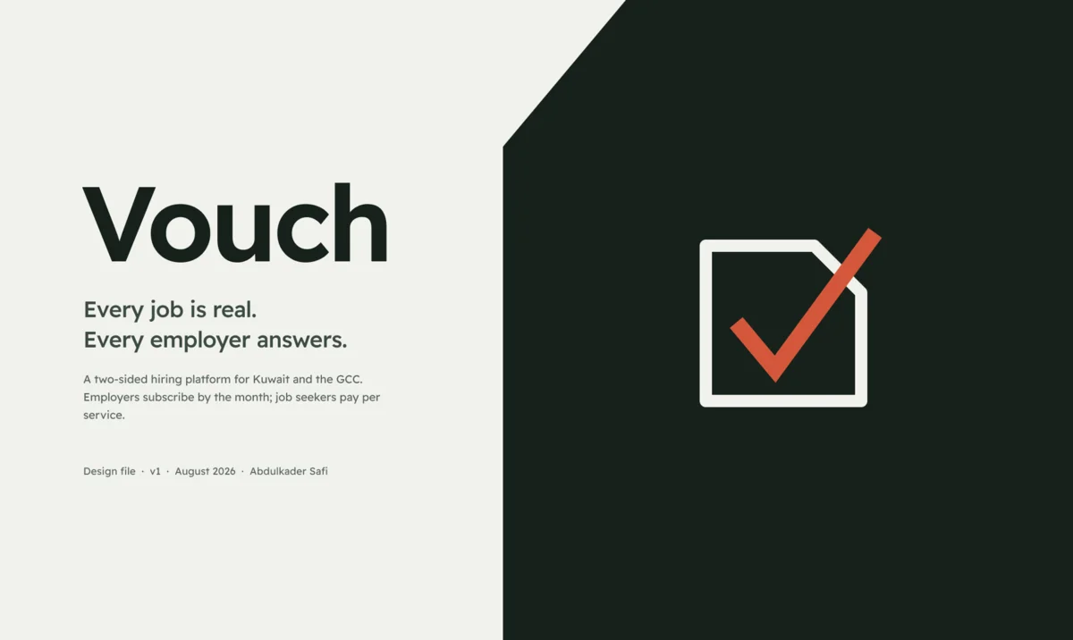
Fifteen desktop screens at 1512 wide, thirteen mobile ones at 390. Built with auto layout throughout, which was not true of my first attempt.
The hero had to prove the claim, not state it
The headline is "Every job is real. Every employer answers." Any product can write that. The question is what sits next to it.
The usual answer is a product screenshot or an abstract illustration. Instead the hero carries an attestation record: a franked ink panel listing what was actually checked for one employer. Commercial register checked 12 Aug 2026. Email domain matches alghanim.com. Vacancy attested by Layla Al-Rashid, Head of Talent. Applicants answered, 87% within 10 business days. Median first response, 3.2 days.
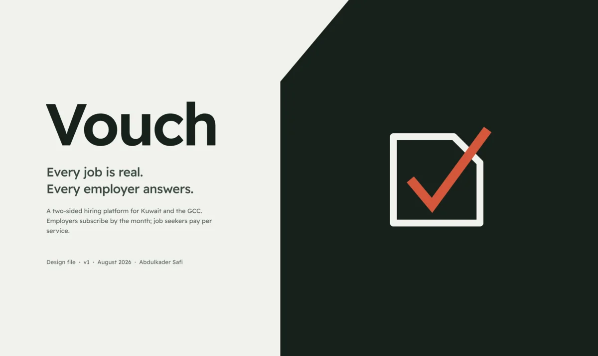
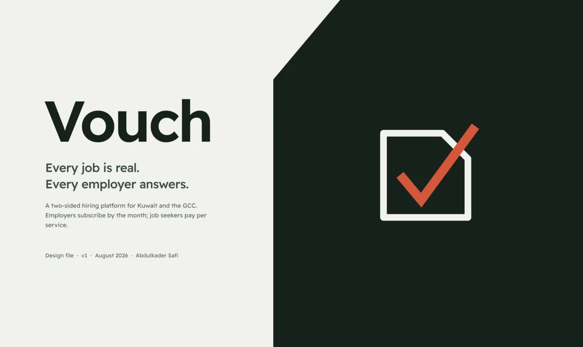
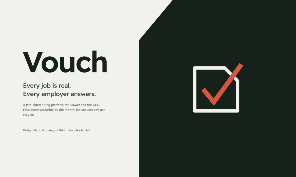
It is the product's actual output, sitting in the hero. And the oxide tick breaks out of the panel through its cut corner, the same move the logo makes, so the hero and the mark are visibly the same idea at two scales.
What we check, and what we do not
The trust page is where the positioning either holds or collapses.
The first two thirds are what you would expect: four checks before a job goes live, three after. Registry check, named attestation, required salary range, human review of every new employer's first listing. Then the response clock, the falling rate when someone stops answering, and the requirement to close filled roles.
The last third is the part I would fight to keep. It is headed "What we do not check" and it says the uncomfortable things: we do not vet the manager or the culture, we require a salary number but do not judge whether it is fair, and listings sourced from partner feeds are unverified employers, labelled as such on every one.
A trust page that only lists strengths is marketing. A trust page that names its own gaps is the thing being claimed.
The filter sidebar, and why it had to actually collapse
Safi pushed back on the first version of the search page: the filters were a flat stack of chips, and they should be a collapsible sidebar.
He was right, and the interesting part was building it so it works. The Filter group is a component set with Expanded and Collapsed variants, and the header carries a CHANGE_TO reaction, so clicking it swaps state inside the prototype.
Two groups sit open with live counts against each option, four sit collapsed showing their current value: Salary reads "KD 1,000+", Location reads "Kuwait City". A collapsed group that shows nothing forces you to open it just to remember what you set.
Where mobile stopped being a narrower desktop
Three places.
The filters become a bottom sheet, triggered by a button that carries the active count as Filters · 4. The sheet is a real overlay: a dimmed clone of the search screen with the panel on top, sliding up, and the scrim dismisses it. That trigger button existed in my first mobile pass and went nowhere, which is exactly the kind of dead control that makes a prototype feel fake.
The "no results" screen changes shape. Desktop offers loosening suggestions as a wrapped chip row. On mobile they are full width tappable rows, each with the count it would add: "Include sourced listings, +16". A chip row at 390 wide becomes an unreadable pile.
The menu needed to exist at all. My first mobile pass had a hamburger glyph with nothing behind it.
The browser extension I cut
The audit said to build a browser extension that autofills Workday, Greenhouse, Lever and iCIMS. It is the strongest acquisition wedge in this category and Simplify built a business on it.
I cut it, because this product launches in Kuwait and the GCC, and those four systems are a US and European play. Gulf hiring runs through Bayt, LinkedIn, GulfTalent, Oracle and SuccessFactors. Building the US version and hoping is how you ship a feature nobody can use.
It comes back later, targeting the systems that are actually here.
Numbers
Fifteen desktop screens in four sections, 168 prototype connections. Thirteen mobile screens in four sections, 59 connections. Every frame auto layout, every card row measured for equal heights and zero overflow.
Next: the dashboards, which is where the compliance work actually lives.
Last updated 17 Aug 2026 · filed under Website, figma, ui, ux