Naming Vouch and finding one shape to sign it
One name died to a live check, one shape ended up carrying the whole system, and the palette was chosen by ruling out everything an AI would have picked.

5 min read


The product had a promise before it had a name: every job here is real, and every employer answers. That rules out a lot of names.
Anything gesturing at speed, AI or matching fights the promise, because speed and matching are what every incumbent already claims. So no "Talent", no "Hire", no "AI", no dropped vowels.
Three candidates, one killed by a five minute check
Wasl, وصل, Arabic for a link or an arrival. One syllable in both languages, means something real in the Gulf rather than being another English SaaS word. It was my favourite.
Then I checked it. wasl.ae is a Dubai semi-government real estate group with its own careers portal. A hiring brand called Wasl in the GCC would spend its entire life being mistaken for them. Dead in five minutes, and much cheaper to find out then than after a logo.
Proof was right on meaning and impossible to own, with the strongest holders sitting in adjacent software.
Vouch won. One syllable, it is a verb, and it is what the product does. An employer is vouched for before a listing goes live. A candidate is vouched for before an employer sees them. It works spoken in Arabic and English without translation, and it reads as a state in the interface: this listing is vouched.
The .com is held by a US insurance company, so the plan is vouch.jobs or a compound, and a trademark search in the GCC across classes 35 and 42 before any money is spent. Neither blocks design.
The idea underneath the visuals
Not a job board. A record of attestation.
Every claim on this platform is signed by someone. The employer attests the vacancy is real. The registry attests the company exists. The clock attests when they answered. So the visual world is official documents and stamps, not SaaS dashboards. That is a world with real history in the Gulf, where the stamp on a document is what makes it true.
It also gives every signal in the interface a job: answer the question "who says so?".
One shape, called the frank
A corner cut at 45 degrees, the way a processed document is notched so you can see at a glance it has been through the office.
It appears on the mark, on vouched job cards, on the lead pricing tier and on the dark bands. Nowhere else. In Arabic it mirrors to the opposite corner, because it is a directional cue rather than decoration.
Having one shape do this much work is the difference between a system and a collection of screens. When you see the notch, you know something has been checked.
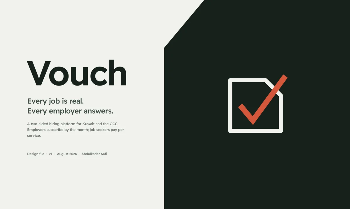
The mark is the same idea at logo scale: a franked square drawn as an ink outline, with an oxide red tick that starts inside and breaks out past the cut edge. The tick crossing the boundary is the whole point. The verification is not contained by the form.
Getting the frank wrong three times
Figma has no clip-path. My first version used an absolutely positioned background vector, which looked correct until I resized an instance and the background stopped tracking it.
The second version was a corner triangle in the page colour, which read as a folded dog-ear rather than a cut. The reason took a minute to spot: the card still had a rounded top-right corner, and a rounded corner fighting a 45 degree diagonal looks like a fold.
The third version works. Zero the top-right radius, pin a 20 by 20 triangle in the page colour to that corner with a MAX constraint, and let the card clip it. It survives any resize.
Worth writing down: clip-path has no Figma equivalent, and an absolutely positioned background does not track an instance resize.
A palette chosen by exclusion
Archival ink #16211C, a green tinted paper #F1F2ED, and an oxide stamp red #A33A22.
Two deliberate absences. There is no blue and no purple anywhere, because blue-to-purple is the default palette of every AI built product and it signals that nobody chose. And the page surface is not the cream that every tasteful site now ships, nor the cool grey that every UI kit ships. It is a green tinted off white derived from the ink itself.
Then I computed every pairing instead of trusting my eyes. Ink on paper is 14.71:1. The muted ink is 5.55:1. The weakest pairing in the whole system is the ghost job ochre on a raised surface at 5.13:1. All clear WCAG AA, which matters because those muted tones carry salary figures, posting ages and response times. Those are the numbers the product argues with.
I had written two contrast figures into an early spec from memory. Both were wrong. Measuring took thirty seconds.
Type, and why the wordmark is drawn
Readex Pro, for three specific reasons. It covers Latin and Arabic in one family drawn for both scripts, so a bilingual product does not fracture between languages. It is SIL Open Font License, so it self hosts with no third party request, which keeps the GDPR surface clean on a product handling candidate data. And it descends from Lexend, which was built for reading, in a product where people read hundreds of listings in a row.
The wordmark is drawn, not set in a typeface. A brand whose signature rests on a free font that ten thousand other products also use has not made a decision. The interface can and should use a free family. The wordmark cannot.
Next: turning all of that into a Figma system where nothing hard codes a hex.
Last updated 17 Aug 2026 · filed under Figma, ui, ux