Every card in the registry drew a black border, and every modal opened with a backdrop that was not there. Both bugs lived in the theme rather than the components, both passed 105 tests, and in the second one the computed style was correct while the screen was blank. What Tailwind v4 changed, and why a colour function can parse and still refuse to paint.
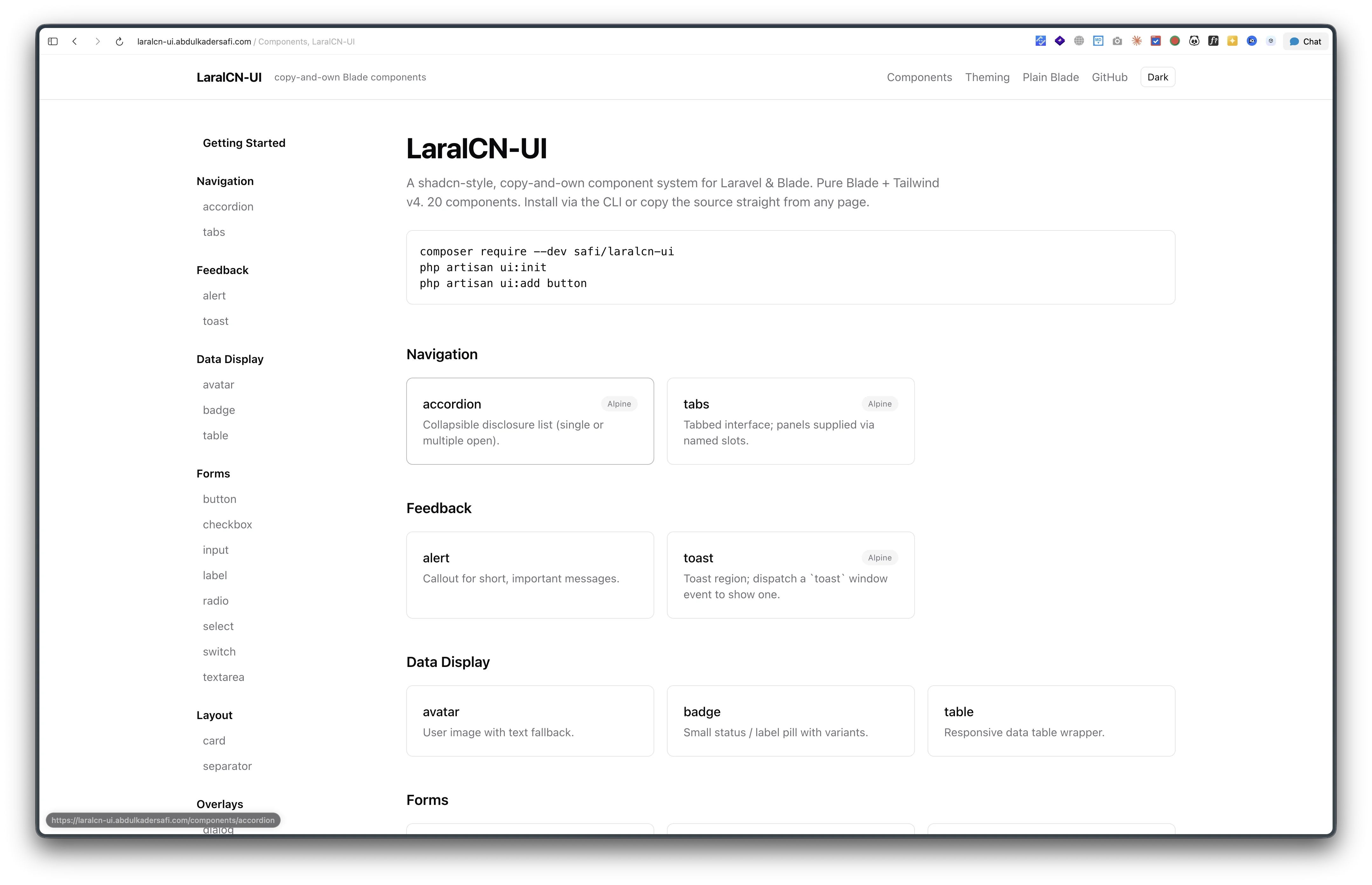
LaralCN-UI is a copy-and-own component system for Blade. php artisan ui:add card writes a .blade.php file into your source tree and you own it from there.
Two bugs shipped in it that the test suite was never going to catch. The suite renders every component and asserts the output is not empty, which proves the Blade compiles. It says nothing about what lands on screen. Both of these were only visible in a browser, and both turned out to live in the theme layer rather than in any component file.
Every card had a black border
The report was a screenshot: a card with a hard black outline, sitting next to a shadcn card with a faint grey one. Same for the accordion dividers.
The card component looked innocent:
$classes = TailwindMerge::merge(
    'flex flex-col gap-6 rounded-xl border bg-card py-6 text-card-foreground shadow-sm',
    $attributes->get('class'),
);
A bare border, exactly like shadcn's. The problem is what a bare border means in Tailwind v4. In v3, border-color defaulted to gray-200, so border alone gave you a light grey line. v4 changed that default to currentColor, so border alone now inherits the text colour. On a card with near-black body text, that is a black border.
shadcn handles this in its base layer. My generated theme block did not have one at all. It defined every token and stopped:
@theme inline {
    --color-border: var(--border);
    /* ... */
}
The fix is one rule, added to the block that ui:init injects:
@layer base {
    *, ::after, ::before, ::backdrop, ::file-selector-button {
        border-color: var(--border);
    }
}
That is the whole change. Nine components were drawing black borders (card, alert, badge outline, accordion, table rows, toast, dialog, dropdown-menu, sheet) and not one component file was edited to fix them. Utilities still win, so border-input and border-transparent behave exactly as before. This is only the default.
The part worth remembering is why I did not catch it earlier. The documentation site looked fine, because its own chrome writes border border-border explicitly on every panel. The site was compensating for the bug everywhere it could, so the only place it showed was inside the component previews. When your app is also your test fixture, it can quietly paper over the thing you are testing.
A modal backdrop that computed correctly and drew nothing
The second one was stranger. Building an alert-dialog for the next release, I opened it and the page behind was not dimmed. Then I opened the existing dialog and found the same thing, so I had inherited the bug rather than written it.
The overlay markup gives no clue:
$overlay = 'absolute inset-0 bg-black/50 opacity-0 transition-opacity
            duration-200 group-data-[state=open]/dialog:opacity-100';
So I asked the browser what it thought:
getComputedStyle(overlay).opacity          // "1"
getComputedStyle(overlay).backgroundColor  // "oklab(0 0 0 / 0.5)"
overlay.getBoundingClientRect().width      // 2273, the full viewport
Opacity 1. Half-opaque black. Covering the whole screen. And no dimming.
Every one of those values is what I wanted. The group-data-[state=open] variant was firing, the element was positioned and sized, the transition had finished. The computed style was correct and the pixels were wrong, which is a combination I had not hit before.
So I stopped reading and started eliminating, setting the background inline and screenshotting after each:
| Value | Painted |
|---|---|
rgb(255, 0, 0) |
yes, whole page red |
rgba(255, 0, 0, 0.6) |
yes, whole page pink |
oklab(0 0 0 / 0.5) |
no |
Alpha was fine. Painting inside the top layer was fine. The failing ingredient was the colour function itself. CSS.supports('background-color', 'oklab(0 0 0 / 0.5)') returns true, so it parses, computes, and then does not composite.
The scope is narrow and that is what made it hard to spot: this only happens inside the <dialog> top layer. In normal flow, /opacity utilities are fine. The bg-primary/20 track on the new progress bar compiles to an oklab colour with alpha and renders perfectly, three inches up the same page.
Tailwind v4 compiles bg-black/50 to exactly the failing form. So four overlays were affected: dialog, alert-dialog, sheet, and the mobile sidebar, which are precisely the four things in the registry built on a native <dialog>. They now use a legacy colour instead:
$overlay = 'absolute inset-0 bg-[rgb(0_0_0/0.5)] opacity-0 ...';
I wrote it into docs/AUTHORING.md with a note not to tidy it back, because bg-black/50 is the obvious cleanup and it silently reintroduces the bug.
What both had in common
Neither bug was in a component. One was a missing line in the theme block, the other was a colour function in four overlay strings, and both were invisible to a green test run.
They also failed in opposite directions, which is the useful part. The border bug was too visible: a black line where a grey one belonged. The scrim bug was not visible at all, and an overlay that renders nothing looks identical to an overlay that was never added. The first kind gets reported. The second kind ships.
Where it is
composer require --dev safi/laralcn-ui, then php artisan ui:init and php artisan ui:add button.
If you already have the components installed, php artisan ui:init refreshes the managed theme block for the border fix, and ui:add dialog (or sheet, or sidebar) picks up the scrim fix. Rebuild your CSS afterwards.
Docs are at laralcn-ui.abdulkadersafi.com and the code is on GitHub.
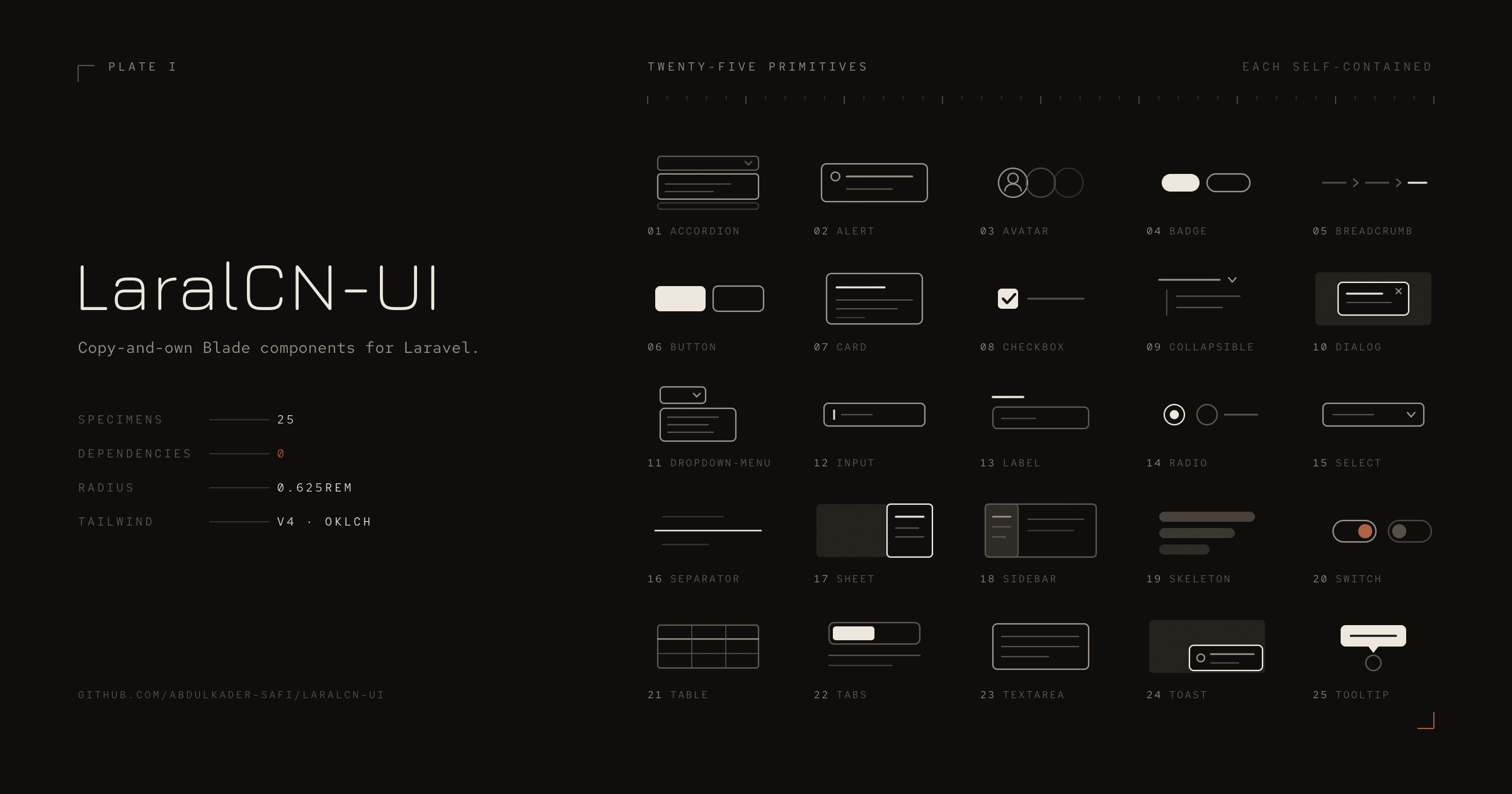
Next post covers 0.4.0, which takes the registry from 25 components to 35, nine of the ten new ones without a line of JavaScript.