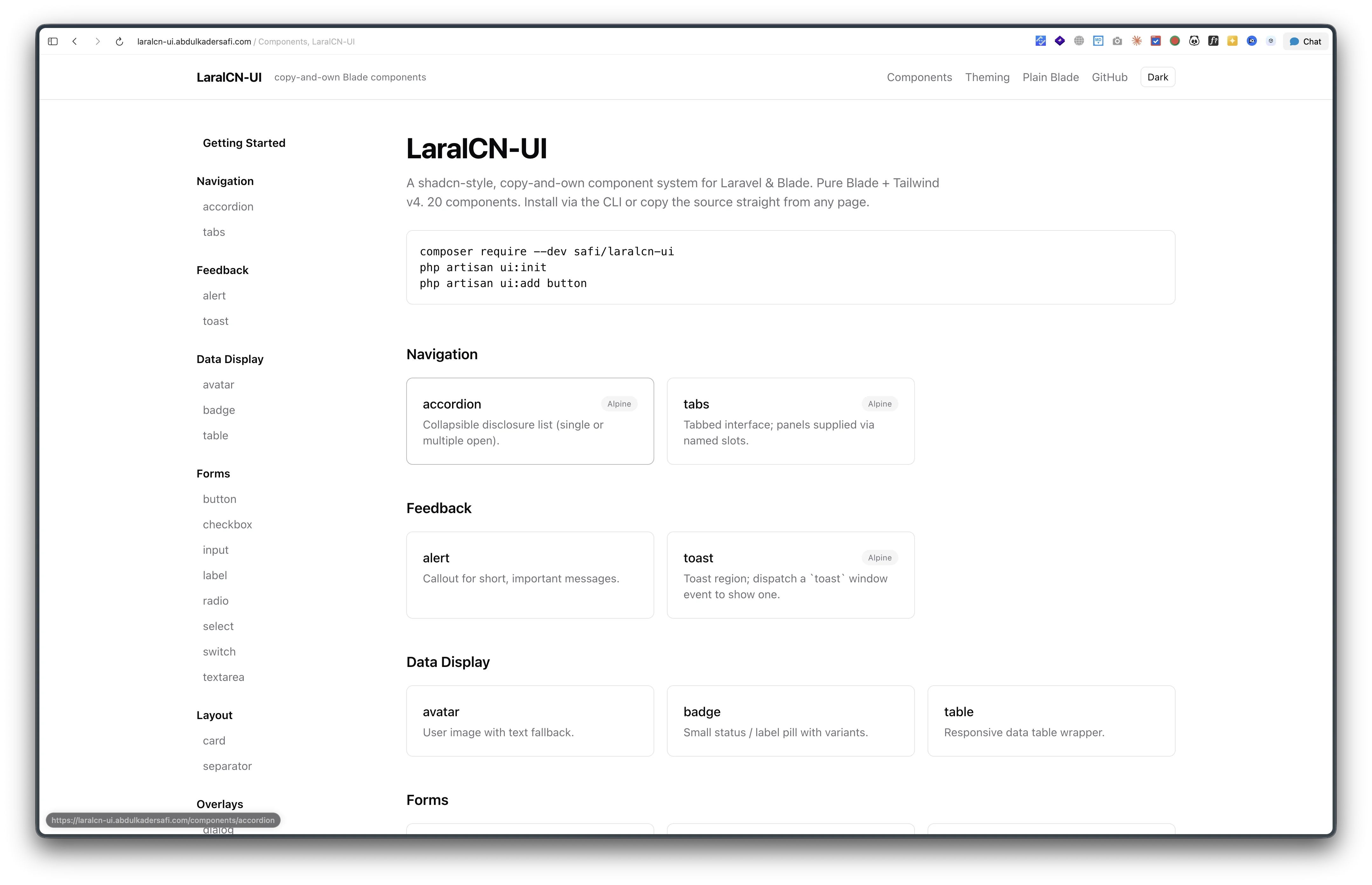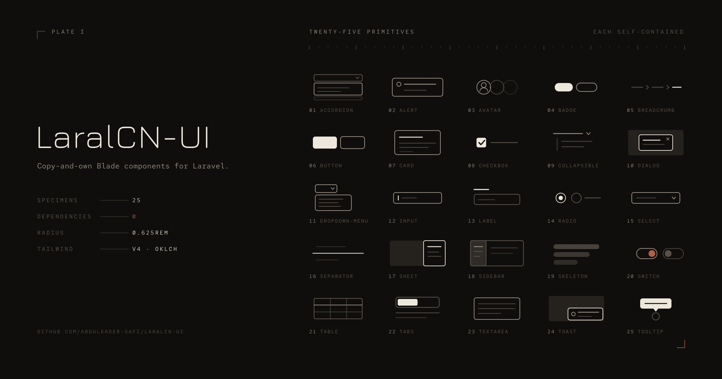
The registry goes from 25 components to 35. A toggle that is a checkbox, a slider that is a range input, a hover card that is pure CSS, and a carousel that keeps working with its script deleted. Plus the three bugs that only turned up once I stopped reading the markup and started clicking it.
0.4.0 adds ten components to LaralCN-UI, taking the registry from 25 to 35.
| Component | JavaScript |
|---|---|
progress |
none |
aspect-ratio |
none |
pagination |
none |
toggle |
none |
slider |
none |
scroll-area |
none |
toggle-group |
none |
hover-card |
none |
alert-dialog |
inline script, native <dialog> |
carousel |
inline script, arrow buttons only |
Nine of the ten ship nothing to execute. That was the selection criterion, not a happy accident: I sorted the gap against shadcn by how much JavaScript each component would cost and built the cheap end first. calendar and chart are deliberately still missing, because a real calendar is several hundred lines of script when <input type="date"> covers the common case, and a chart needs a charting library, which the authoring rules forbid.
Let the browser own the state
Three of these are form controls, and in every case the native element already does the hard part.
toggle is a checkbox wearing a button:
<label class="... has-[:checked]:bg-accent has-[:checked]:text-accent-foreground">
    <input type="checkbox" class="peer sr-only" name="{{ $name }}" @checked($pressed) />
    {{ $slot }}
</label>
It submits with the form, answers the spacebar, and exposes its pressed state to assistive tech without a line of script or a single aria-pressed update.
toggle-group extends that: single-select renders radio inputs sharing a name, multi-select renders checkboxes. Radios also hand you arrow-key navigation between items at no cost.
slider is an <input type="range">, so dragging, arrow keys, and Home/End all come from the browser. The price is paid in styling, because the track and thumb are vendor pseudo-elements and each engine needs its own rules:
$webkit = '[&::-webkit-slider-runnable-track]:h-1.5 ... [&::-webkit-slider-thumb]:size-4 ...';
$firefox = '[&::-moz-range-track]:h-1.5 ... [&::-moz-range-thumb]:size-4 ...';
Both sets are required. Drop either and the slider is unstyled in that browser, which is exactly the kind of thing you do not notice until someone else opens it.
Two details worth stealing
Hover states that cannot be repainted. A pressed toggle needs its accent background to survive being hovered. The obvious way is hover:bg-muted plus has-[:checked]:bg-accent, and then which one wins depends on the order Tailwind happens to emit them in, because they have equal specificity. Scoping the hover makes it order-independent:
$hover = '[&:not(:has(:checked))]:hover:bg-muted
          [&:not(:has(:checked))]:hover:text-muted-foreground';
Uglier to read, impossible to get wrong.
Passing props to child components without a shared helper. Components here have to be self-contained, so toggle-group cannot reach into a PHP helper to share its variant and size with its items. Blade's @aware covers it:
@aware(['multiple' => false, 'name' => 'toggle-group', 'variant' => 'default', 'size' => 'md'])
With one catch that is easy to lose an hour to: @aware only sees attributes actually passed to the parent tag, never the parent's defaults. So every default is written twice, once in the parent's @props and once as the @aware fallback, with a comment tying them together.
Three things that went wrong
None of these came from reading the code.
The hover card was silently full width. It rendered, it opened on hover, and it stretched across the whole preview. w-64 was on an inline <span>, and width does nothing to an inline box. The positioning wrapper escaped this only because position: absolute blockifies an element, which is why the outer element behaved and the inner one did not. One block class fixed it.
There is a related detail in the same component that was right by design: the gap between trigger and card is padding on the positioning wrapper, never margin on the card. Margin leaves a dead strip, and the card closes the moment the pointer sets off toward it.
The carousel skipped slides. The arrows scrolled by one viewport width:
track.scrollBy({ left: track.clientWidth, behavior: 'smooth' });
Slides sit in a gap-4 flex row, so a viewport-sized step is short by the gap every single press. The error accumulates, and scroll-snap eventually resolves it by jumping an extra slide. Clicking through it went 1, then 4. It now measures the next item's actual edge and scrolls there, which also gives correct stop-at-the-end behaviour for free:
var origin = track.getBoundingClientRect().left;
var edges = Array.prototype.map.call(track.children, function (item) {
    return Math.round(track.scrollLeft + item.getBoundingClientRect().left - origin);
});
var target = edges.filter(function (edge) { return edge > Math.round(track.scrollLeft) + 1; })[0];
if (target === undefined) return;
track.scrollTo({ left: target, behavior: 'smooth' });
The alert dialog had no backdrop, and neither did the dialog, sheet, or mobile sidebar that shipped months ago. That one is its own story: the computed style was a correct half-opaque black covering the viewport, and the screen stayed undimmed. The previous post covers it.
The carousel is the only one that needed script
Even there, the script does one thing. Scroll-snap carries the whole interaction: swiping, trackpad scrolling, dragging the scrollbar, keyboard scrolling. Arrow buttons have no declarative equivalent, so they get about fifteen lines, delegated from document like every other script in the registry. Delete the <script> block and the carousel still works everywhere except those two buttons.
alert-dialog uses a native <dialog> with showModal(), which brings the top layer, a focus trap, Escape, and an inert page. It differs from dialog in two deliberate ways: no close button, and the overlay does nothing when clicked, because an alert dialog is dismissed by choosing an action. Self-containment means it cannot borrow dialog's script, so it carries its own copy under its own attribute names. That duplication is a requirement rather than an oversight, and it is commented as such.
Where it is
composer require --dev safi/laralcn-ui, then:
php artisan ui:init
php artisan ui:add progress aspect-ratio pagination toggle slider
php artisan ui:add scroll-area toggle-group hover-card alert-dialog carousel
35 components and 7 blocks, Tailwind v4 only, MIT. Docs at laralcn-ui.abdulkadersafi.com, code on GitHub.
Next up is the tier that actually needs script: popover, command, context-menu, and friends.