Making it a phone app: a service worker that was worse than no service worker
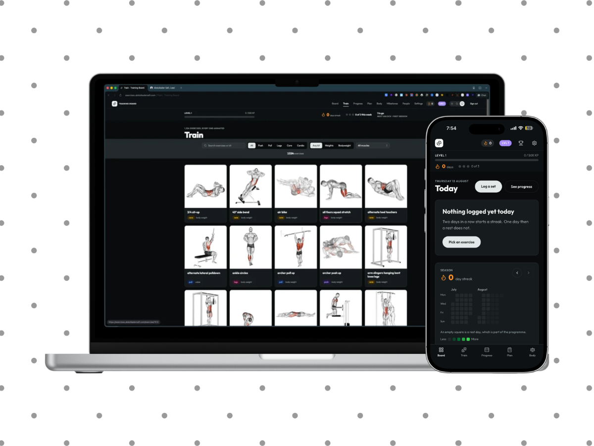
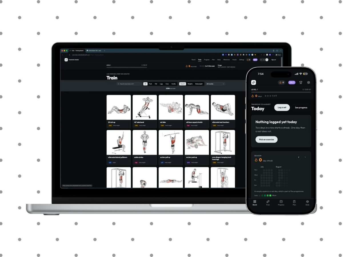
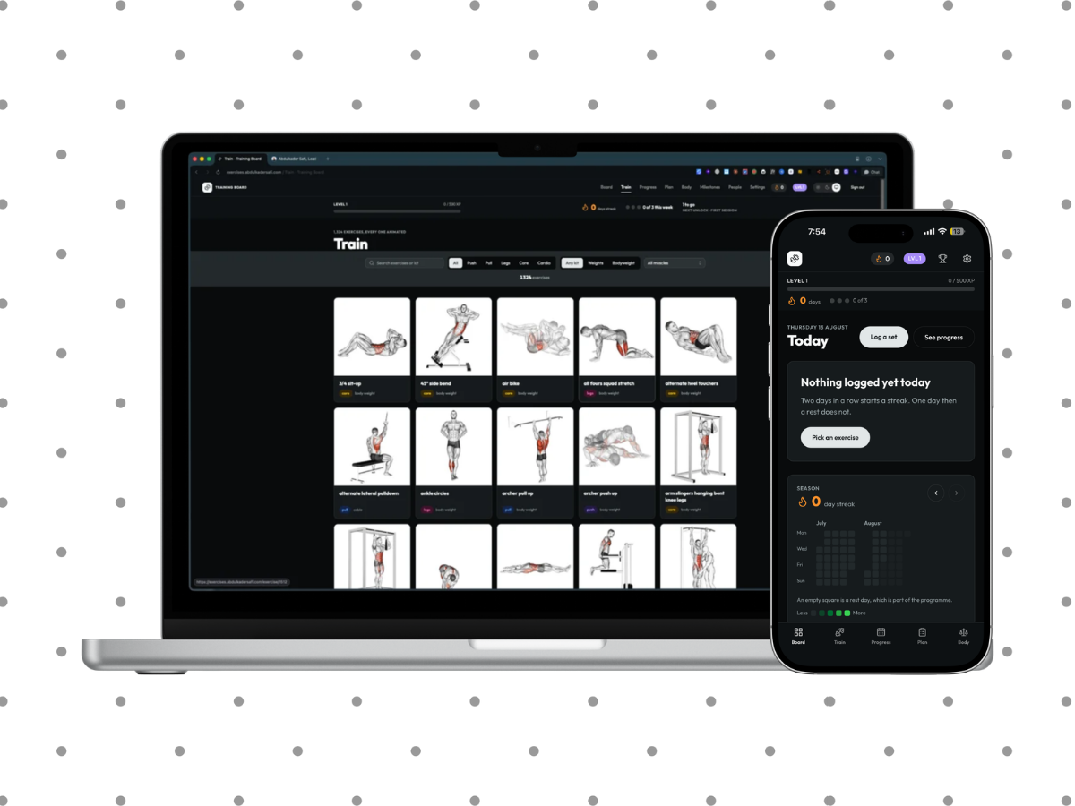
The board was laid out for a desktop browser that happened to be narrow. Turning it into something usable one-handed in a gym: bottom nav, a manifest, twelve iOS splash sizes, and three bugs a desktop will never show you. One of them was my own service worker stalling every image after the first.

8 min read


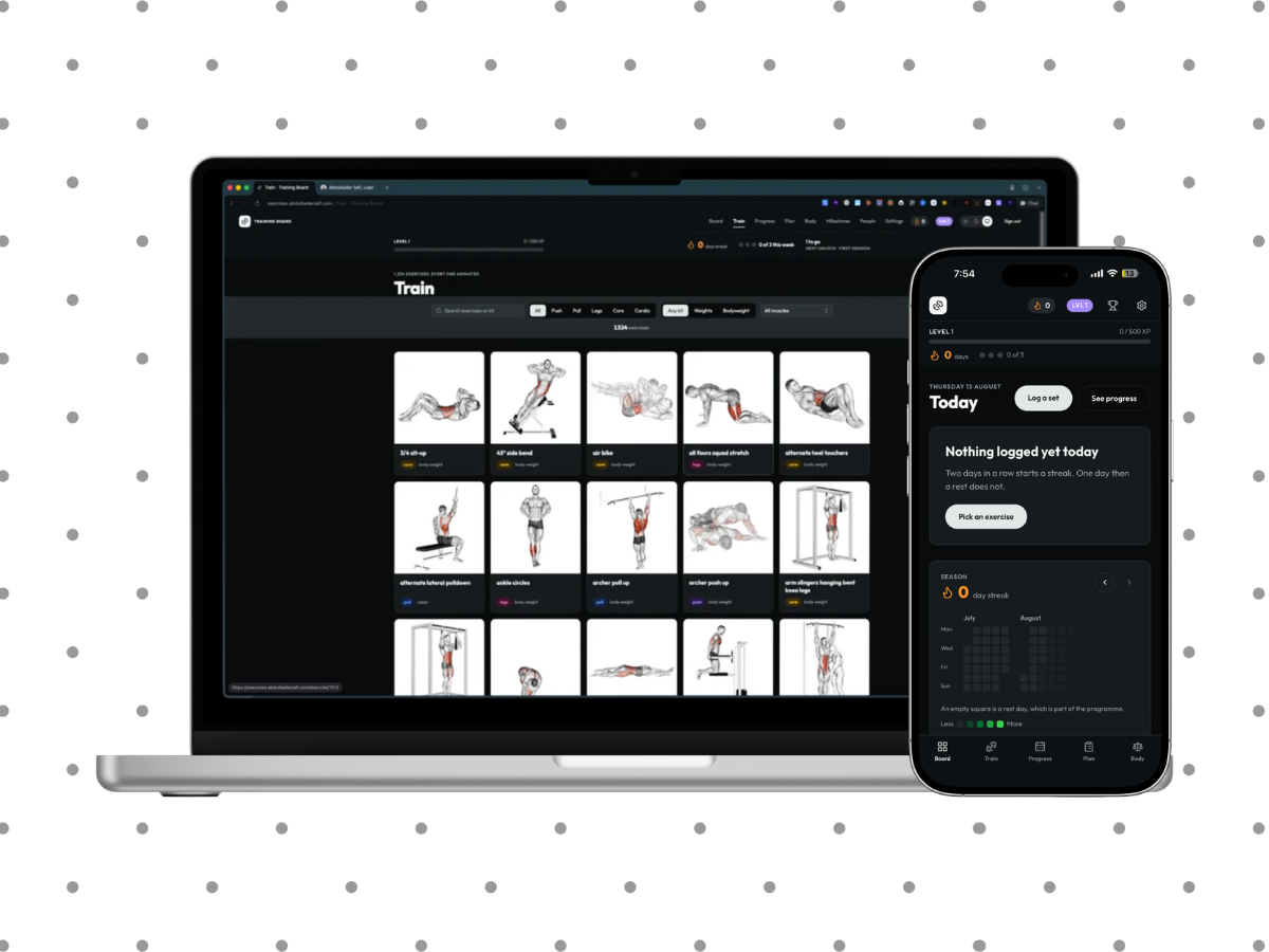
The app is used on a phone, in a gym, one-handed, with a bar in the other hand. Until this point it was laid out for a desktop browser that happened to be narrow, which is a different thing and reads like one.
This is what it took to fix that, including the parts I broke myself.
Navigation goes where the thumb already is
Under 768px the nav moves to the bottom. The top bar stays, because deleting it would have taken sign out with it, and stops being sticky at that width so it scrolls away while the bottom bar carries the links.
Two spacing rules that are easy to miss and obvious once wrong: the bar clears the home indicator, and the page content clears the bar.
A week later I reversed the sticky decision. In practice sign out, milestones and settings only lived up there, so reaching any of them meant scrolling back to the top of a page that can be several thousand pixels long. It is sticky at every width now. That costs 60px of a phone screen, which is the trade, and I would rather pay it than make someone scroll 3,000px to sign out.
Installable, and the splash screen that was one phone
A manifest and a set of icons make it installable, which drops the browser chrome and gives back around 100px of vertical space. Icons are generated from the logo by a script, using the dark background variant as the source so the icon, the manifest background and the splash art are the same near-black instead of flashing white between them.
Then the splash screen never appeared, and the reason is a genuinely surprising piece of iOS behaviour.
iOS uses a startup image only when its media query matches the device exactly. There is no nearest-match and no fallback. I had one entry, sized for a 14 Plus, which meant the splash worked on exactly one phone and silently did nothing on every other.
The generator now renders all twelve iPhone sizes still in use and writes the link list into a TypeScript file the layout imports, so the art and the markup cannot drift apart. Verified by checking all twelve links are emitted and every file actually serves.
The status bar was sitting on the nav
The nav was underneath the clock, the island and the battery. The cause was one meta tag:
<meta name="apple-mobile-web-app-status-bar-style" content="black-translucent" />
That tells iOS the web view starts at the very top of the screen and the status bar floats over it. It is the right setting for a photo viewer and the wrong one for an app with a row of controls at the top.
It is black now, so iOS reserves the status bar area and starts the page below it, which is what a near-black nav wanted anyway. Belt and braces, the nav also carries padding-top: env(safe-area-inset-top) and a minimum height rather than a fixed one, so any device that still overlays pushes the bar down instead of drawing under it. Simulating a 59px inset, the bar grows to 95px and the mark lands at 61px, clear of the status bar, and stays at 60px when there is no inset.
The grid was one column of 1,324 cards
Three separate bug reports, one cause.
At 390px the grid's minmax(13rem, 1fr) fell to a single column. Every card became 350px wide and 427px tall. The maths:
407,559px page height
 12,167 DOM nodes
Worse, contain-intrinsic-size claimed 288px against that real 427px. An error of 139px per card, times a thousand cards, means the browser is permanently re-estimating the total scroll height and never settling.
That single fact explains all three reports. It felt laggy because layout never stopped. Images never caught up because the viewport intersection kept moving. And tapping a card opened nothing, because the content shifted under your finger between the touch and the release, so the tap landed somewhere else.
The grid is two columns on a phone now, and pages at 48 cards with a "Show 96 more" link that keeps the current filters. content-visibility went with the uncapped list, because its whole job was making a list that long survivable and its size guess was what broke the taps.
Measured after: 8,552px, 688 nodes, cards 246px tall, no drift while idle, and all three hit-test points land inside the card.
The project's own docs used to say not to add pagination because CSS was handling it. That was written from desktop measurements and it was wrong.
The service worker that stalled every image
This is the one I want to write down properly, because it was my bug and it only exists on a phone.
A thirty line service worker caches exercise animations cache-first. The original version did this:
const res = await fetch(req);
cache.put(req, res.clone());
return res;
Two things then go wrong, and neither shows up on a desktop.
An installed PWA gets a much smaller Cache Storage quota than a browser tab. The catalogue is 119 MB of animations, so cache.put starts rejecting within a few images. That rejection is a floating promise and nothing handles it.
Then the second half. The clone is never consumed once the put fails, and an abandoned clone makes the browser buffer the entire response body rather than streaming it. That stalls the original response, the one being returned to the page.
Which is precisely the reported symptom: the first image arrives, every one after it hangs.
The rewrite follows one rule. A service worker must never be worse than no service worker. So:
- The cache is bounded at 250 entries, roughly 23 MB, oldest evicted first.
- Every cache operation is optional and caught.
- The clone is consumed inside
event.waitUntil, so the write finishes before the worker is allowed to sleep. - The cache name is bumped, so the activate handler clears the broken cache on every device the first time the new worker runs.
Verified by scrolling the full 1,324 card grid, which pushed the cache to exactly its 250 cap with 810 images loaded and none broken. And with the network fully off, a previously viewed animation came back 200 from cache, 118 KB, and decoded.
Caching the media properly, and the button that undoes it
The route serving media sent no Cache-Control at all, so every animation was refetched on every visit. At 92 KB a card across 1,324 cards, that is 119 MB of repeat traffic.
They are immutable for a year now, which is safe because upload filenames carry a random suffix and are never rewritten in place. Together with the service worker, an animation costs 92 KB once and nothing after that.
That leaves the obvious hole. Replace a file and every phone keeps serving the old one for a year. So there is a "Refresh the image cache" button in the admin. It raises a version number that is appended to every media URL, which is a new key in the browser cache, the service worker cache and any proxy in between, all at once. The board drops its stored media cache when it notices the version moved, so a device does not carry animations it will never ask for again.
The trade is worth saying out loud rather than hiding: the first load after a bump is slow again, then instant.
Two smaller things that mattered in the gym
Logging a set is optimistic. On a throttled connection the set is on screen 200ms after the tap, dimmed, while the button still says Saving. A failure reverts the row and offers Retry.
There is a wake lock toggle that holds the screen on between sets, shown only where the API exists. A toggle rather than automatic, because silently keeping someone's screen awake is a battery surprise. It retakes the lock when the tab comes back, since the browser drops it whenever the tab is hidden.
The CSS rule that would not apply
In landscape a phone has about 380px of height, and the page header band alone was taller than that. So the band collapses and the coverage panel hides below 480px.
That rule had to sit outside @layer base. Rules inside it lose to Tailwind's utilities layer regardless of their specificity, so md:py-14 kept winning against a more specific media query. It is the kind of thing you can stare at in devtools for a while, because the rule is right there in the stylesheet and simply not applying.
Reloading once after a deploy
Without this, the first launch after a deploy still runs the old build's JavaScript and only the launch after that is correct.
The app now reloads itself once when a newly deployed service worker takes over. The listener is armed only when a worker was already controlling the page, so a first ever visit installs the worker and does not reload.
No reinstall is needed for any of it: the worker is served with max-age=0 and pages with no-store, so a force close and reopen picks up a deploy.
116 tests pass. The last item on the plan stays open, and it is the only one that matters: use it in an actual gym.
Last updated 17 Aug 2026 · filed under Tailwindcss, typescript, css, javascript, nextjs, react, frontend, ui, ux