The progression redesign: XP nobody stores, and a streak that allows rest days
The board was a catalogue with statistics bolted on top. Rebuilding it as a progression view: a HUD strip, a season grid, milestone tiers, and a day streak that survives a rest day on purpose. Plus the dark mode that existed in the tokens for weeks and was never once reachable.

6 min read


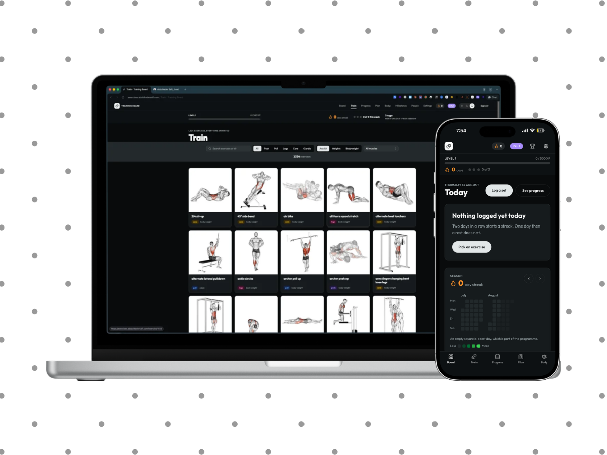
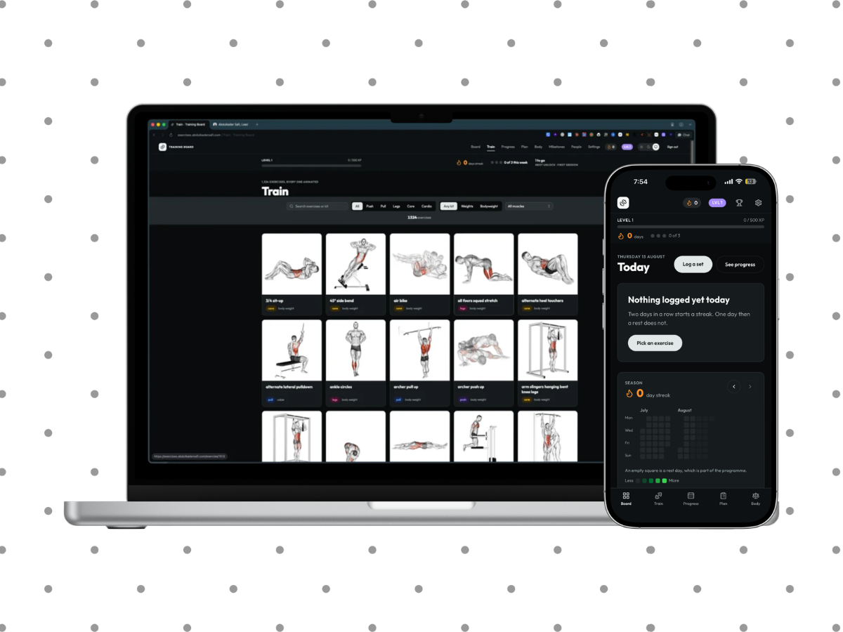
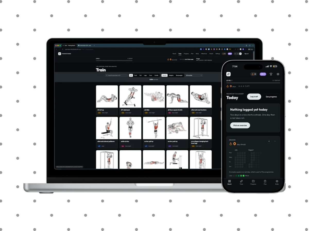
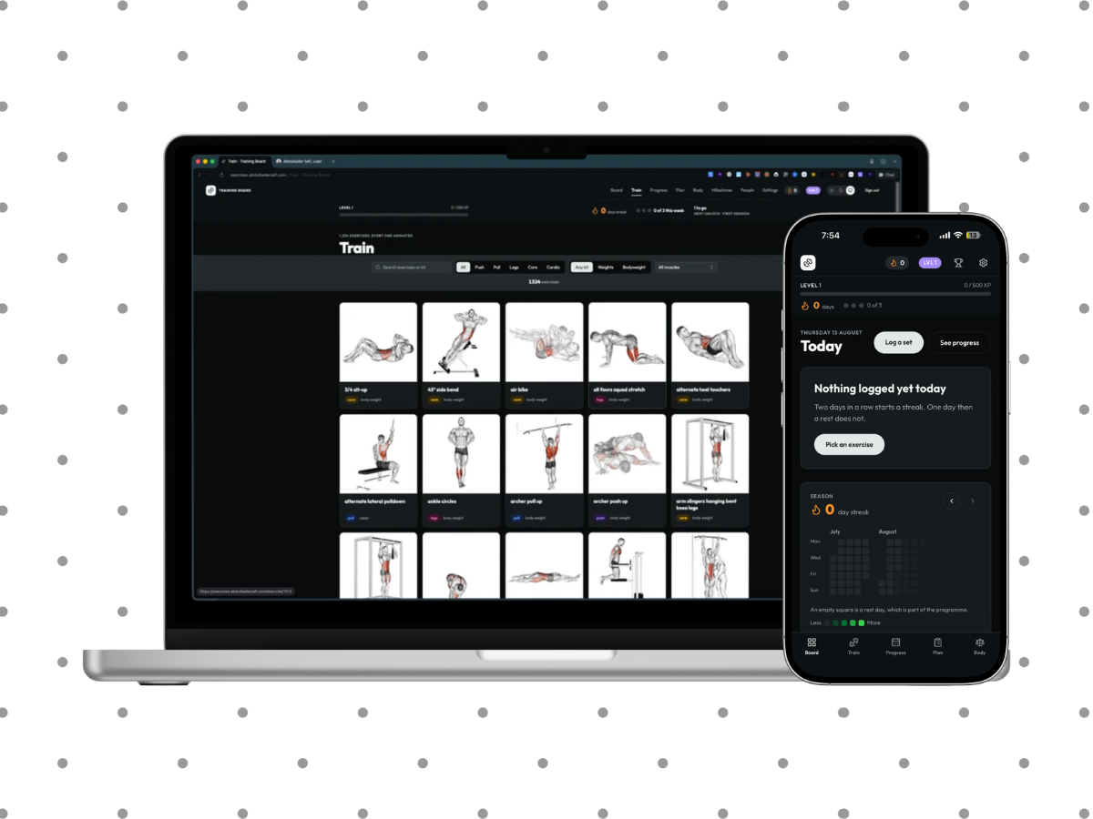
By this point the app worked and read like a database with a stylesheet. Open it and you got 1,324 exercise cards with today's totals sitting above them. Everything you had earned, the streak, the milestones, the volume curve, was somewhere else.
The redesign moved the whole thing onto a progression layer. Not more features: the same training data, arranged so the first screen answers "how am I doing" instead of "what exercises exist".
Before any of it, one finding from the research shaped the scope. Gamification stops helping past a point, and past that point it actively distracts from the activity. So the plan totals five mechanics and then stops, on purpose. Everything below is inside that budget.
XP is derived, not stored
A flat rate per set, plus a milestone payout that varies by tier. Nothing is written to a column.
This is worth doing deliberately. The moment XP is a stored integer, retuning the economy is a migration and a backfill, and any bug in the awarding path is permanent in a way you have to write a script to undo. Derived, the numbers can be changed in a commit and everybody's history recomputes correctly on the next read.
The trade is a read cost, which is why the HUD has its own query rather than reusing the full statistics pass:
getProgress() // one set read, one milestone read, levels and streaks in memory
The full collectStats computes everything the progress page shows. Running it on every page render to draw a level number would have been the lazy version and the wrong one.
A day streak that allows rest days
Earlier in the project I deleted a day streak and replaced it with one that counts weeks, on the grounds that rest is part of a training programme and a daily streak punishes correct behaviour. That reasoning has not changed, and the headline streak is still weekly.
The progression layer adds a day streak anyway, with a rule that does not fight the programme:
Training days come in runs of at least two consecutive days, separated by at most one rest day. Two rest days in a row ends the run, and so does a finished run of a single day.
So a four-day split with a rest day in the middle keeps its streak. A programmed rest day is not a break. What ends it is drifting: two days off, or a single isolated session with nothing either side of it.
One exemption matters for how it feels. The run in progress is exempt from the two-day minimum while today can still extend it. Without that, training on a Monday shows you a streak of zero until Tuesday, which reads as the app not noticing.
The three day-streak milestones read off the best run ever, not the current one, so a rest week can never take back a badge already earned. A milestone that can be revoked is not a milestone.
Tiers, and sorting the wall
Every milestone now carries a bronze, silver or gold tier. The tier drives both its colour on the wall and the XP it pays, so one field does two jobs and there is no second table of payouts to keep in sync.
The wall itself had a problem that only shows up once you look at it as a new user. Locked milestones were in definition order, which put "250 sessions" above "10 sessions". That reads as a wall. Sorted by how close you are to each, the same grid reads as a route.
The season grid, and why it is two months
A contribution-style grid of training intensity per day. The obvious version is a year, the way GitHub does it.
A year is 53 columns. On a phone, 53 columns either scroll sideways, which nobody discovers, or shrink below the point where a cell is legible or tappable. So it pages two months at a time.
The grid maths lives in pure functions:
monthGrid(year, month)   // the cells, with their weekday offsets
heatLevel(volume, max)   // which band a day falls into
Which keeps the grid itself a thin client component over logic that has tests. Anything that needs the DOM is hard to test, so as little as possible needs the DOM.
Chrome is its own token, because the nav must not invert
The design system already had light and dark tokens. The game layer added more: split hues for push, pull, legs, core and cardio, the three milestone tiers, XP, and the heat ramp for the season grid, all as CSS variables in both modes.
One of them deserves its own paragraph. The nav and the HUD sit on a token called chrome rather than on primary.
primary is a semantic token, so it inverts in dark mode, which is correct for a button and wrong for the app frame. A nav that flips to near-white in dark mode stops being the frame and starts being a large bright rectangle at the top of a dark page. chrome stays dark in both modes, which is what a frame does.
The same reasoning removed the strong band from every page. It inverted to near-white in dark mode and read as a second header stacked under the nav. Pages are now a single column on the page background, with tiles supplying their own surfaces.
Dark mode existed and was unreachable
This is my favourite kind of bug, in that nothing was broken.
Dark tokens had been in the stylesheet for weeks. Every component had a dark variant. The whole system was written, reviewed and correct.
Nothing ever set the class. There was no switch, no media query listener, and no default. Dark mode was fully implemented and had never once been rendered.
There is a three-way light, dark and system switch now, applied before first paint so there is no white flash on load. Which is the part people notice, and the part that is easy to leave for later and then never do.
The pages moved
The board became the progression view. The catalogue moved to /train, so reaching your own training no longer means scrolling past 1,324 cards to get to it. History became /progress.
The old history path is kept as a redirect rather than deleted, and the reason is specific to shipping a PWA: installed phones have the old path cached, and an installed app that opens a 404 after an update looks broken in a way a browser tab does not.
Two things I broke and put back
The weekly muscle coverage panel disappeared during the rebuild. It is the one panel that answers "what have I not trained this week", which is the question the whole coverage feature exists for.
And I replaced the brand mark with something generic while moving the nav onto the chrome surface, which was not a design decision so much as a casualty. Restored.
The HUD needed a second pass too. On a phone it stacked three blocks and pushed the page itself below the fold, which defeats the point of a strip whose only job is being in view. It is compact at that width now.
Last updated 17 Aug 2026 · filed under Tailwindcss, typescript, css, nextjs, shadcn, react, frontend, ui, ux