Two UI critique rounds
A UX review and a scored critique (27 out of 40) on GitBasedDocs, what each one found, and the fixes that landed as one commit per finding.

5 min read


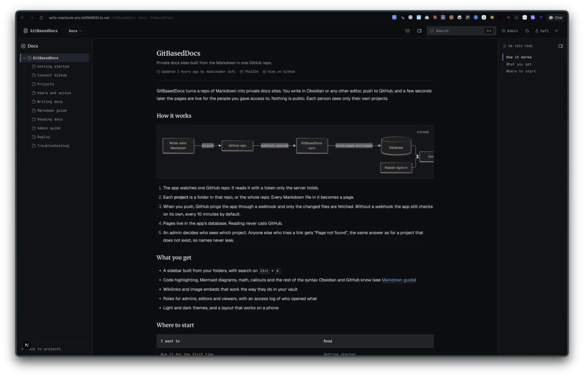
By early afternoon on September 10 the core of GitBasedDocs worked: sign-in, sync, the doc viewer, the admin screens. Then I spent the rest of the day on how it looked and felt. There were two review rounds, and every finding became a card on the task board so each fix could land as its own commit.
Round one: a UX review, four cards
The first review went through the app at desktop width and at 400px. It produced four cards in docs/Git-Based-Docs-Todo/ux/.
Phone layout was the first card. At 400px the top bar cut the product name to "GitBasedDo", and the search button, project switcher and Admin link sat on top of each other. The users table scrolled sideways, which put role, status and the actions menu off screen. Below sm the wordmark and Admin link are now icon only, and below lg each user shows as a stacked row with the actions menu in reach. I checked it at 360px and 1512px.
Admin navigation was the second card. Moving between admin pages meant bouncing back through /admin every time. Now there is a sidebar on desktop and a scrolling tab row on phones, one 1120px content width for every admin page, and an overview with five stat tiles instead of five stacked link cards. The danger zone moved to its own page, and projects got an edit dialog, the first way to edit one from the UI.
Colour was the third. I picked ink blue as the accent: oklch(0.52 0.18 264) in light and oklch(0.74 0.12 264) in dark. Measured contrast is 5.6:1 for blue text in light mode and 8.3:1 in dark. The dark greys moved from stone to a cool slate, because the stone greys read brown. Every status now uses one outlined Chip component instead of solid green blocks. On touch screens, pointer-coarse: grows icon buttons and small buttons to 40px.
That card also turned up a real bug. Links styled as outline buttons, like Filter and Archive, had lost their border. The base class border-transparent was winning over border-border. buttonVariants() now merges its own classes.
The reading card added the "On this page" outline, links in the accent colour with an underline so they stand out without hovering, and a blue bar on the current page in the sidebar. It also removed a breadcrumb that read "Docs / Docs" on the landing page.
Two smaller changes followed. Page width is one button that cycles Narrow (42rem), Wide (64rem) and Full. I asked for a button, not a dropdown. A script in <head> applies the saved width before first paint, so the page never jumps on reload. And sidebar nesting now draws a guide line under each folder, stepping in 16px per level, the way Obsidian and VS Code draw it.
Round two: 27 out of 40
The second round was a scored critique, saved in .impeccable/critique/. It ran with two agents: one doing a design review, and one running a detector and a real browser. It scored ten usability heuristics out of 4 each.
The lowest scores, 2 each, went to three of them:
- User control: Archive on a project row jumped to the danger zone and forgot which project you meant.
- Recognition over recall: admins had to remember repo paths and make up temporary passwords.
- Error recovery: the 404 page never mentioned access, and wide diagrams shrank until they were unreadable.
One line in its verdict stood out: "Git disappears for readers: no commit, author or path on a page." That became its own feature, committed a few minutes after the last of the fixes below: every page now shows who changed it last.
The top five
The critique listed five P1 issues. I took all five, one commit each.
- Wide Mermaid diagrams. Labels shrank to about 7px, and 3px on phones. Diagrams now fit the column down to 75% of natural size, then scroll, and an Expand button opens a native dialog. The flowchart on the docs overview went from about 7px labels to 12px.
- The phone pages menu was not a real modal. Escape did nothing, focus stayed on the body, and the page behind it could still be reached. It is now a native
<dialog>, and any open modal locks page scroll withhtml:has(dialog[open]:modal). - Most pages had no browser tab title, which fails WCAG 2.4.2. The root layout now has a
%s · GitBasedDocstemplate. - The whole Markdown pipeline was shipping to the browser because a client component imported one small function from the renderer. After moving that function to its own file, the doc page loads 205K of JavaScript, uncompressed, with none of the pipeline in it.
- Archive from the Projects page opened the danger zone with the first project picked. It now links to
/admin/danger?archive=<slug>, which opens that project's confirm with focus in the phrase box.
Still open
The card for round two lists the next tier, not started yet. Focus outlines are faint (1px at 50%) and there is no skip link. Search snippets show raw table pipes and Mermaid source. A few contrast values miss by a hair: code labels at 4.49:1, tip and danger callout titles at 4.40:1 and 4.24:1. Some tap targets are too small, like the 16px "View on GitHub" link. And the 404 page should say "or you don't have access".
Last updated 10 Sep 2026 · filed under Tailwindcss, shadcn, frontend, ui, ux